You have written the best copy for your website. The images are amazing, the graphics are polished but somehow, your not getting the sales.
You are also ranking on Google and getting traffic, but somehow these are not converting into sales, and it’s starting to worry you.
Why is this happening, and what can you do about these insufficient sales numbers? Why are these visitors who come to your site leaving quickly? Unfortunately, there is a vast difference between online traffic and actual sales. Getting people on your site to buy from you is an art and a combination of many factors. There are so many mistakes, and stuff-ups you can make that turn people and potential customers off. Missing these sales is a lost opportunity, so you must make sure that you address all on-page website issues that could be hampering your conversion rates.In this article, I want to address why people leave your site without purchasing or calling you.
1) Old website design
Forbes tells us that: It is clear that a high-quality brand website is now an integral component of any effective digital marketing strategy and that consumer standards for web design are higher than ever.Consumers, shoppers and web browsers, according to Statista, daily mobile internet consumption is set to increase to 155 minutes in 2021.The above means that people are used to seeing the latest web trends and styles online. If your website isn’t up-to-date with the latest plugins, features, and looks, people might trust the site less. They will look elsewhere with the flick of a finger. It’s that easy. Browsers and your potential customers are all conditioned by the multitude of sites they see. If you haven’t updated your website in the past couple of years, it’s time to give it a complete overhaul. Outdated web design is a primary reason why people will leave your site; get it fixed quickly. You can see how a site refresh for Doolan Wagner ( one of our web design clients ) gave customers a better user experience. And, as a result, inquiries have skyrocketed. View the case study here.Hopping Mad Designs Tip
: best give it to a web design agency with experience in customer conversion rates. There are free DIY web templates online where you can save money, but this is not a good idea.
2) Your website’s content is challenging to read.
Have you taken a close look at your website and noticed how hard it was to read? Are the fonts too small, is there a mix of clashing colours and are the graphics simply too complicated?For the best web design experience, you want users to find what they are looking for quickly. Sweor explains that; the best (and only) way to get rid of snap judgements on your homepage is to improve its design.There are some easy ways to fix the readability of your website.i) increase font size – people don’t want to have to squint to read your site.ii) line-height – don’t keep spacing between lines too small. Make browsing large chunks of text easy.iii) contrast between text and colour background – try to make it white background with black text – never a light colour text on a pale background.iv) narrow lines – it’s far easier for customers to read narrow lines than long lines, which are 2 to 3 sentences.v) use subheadings – breaking long paragraphs up with subheadings so browsers can skim the content easily and find what they are looking for quickly. A rule of thumb is a sub-heading every 2 to 3 paragraphs.vi) use bullet points – a great way to highlight points as breakouts from the text – perfect for lists or summarising details.vii) use real-life images – avoid overuse of stock images as they tend to be cheesy. Users can spot this a mile away, and it can break down the authenticity and trust of the website.viii) short snappy sentences – long sentences can lose people. Remember, attention spans are sort online as The Guardian reminds us: keep page content short and punchy and split any detailed content out into secondary pages if applicable.ix) new paragraph every 3 to 4 lines, making content more digestible and easier to find critical points.x) keep graphics to a minimum – don’t overcompensate your site with too many graphics. People cannot absorb all that information.
3) Your site relies on outdated plugins
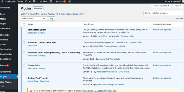
The last thing people want to do is install a plug in to visit your site. I don’t care how great your site is or how fantastic your service is; people will not spend the time ( even if it is for a couple of minutes ) to download some plug in to view your site.
Here are some signs that you’re a plugin hoarder.
-You have no idea what your plugins do. Your developer installed them years ago, and you can’t even remember why. The worst part is that all these plugins take time to load, which can slow down your website load times, harming your internet rankings through higher bounce rates.
-You cannot update your WordPress site because of these old plugins. Old plugins can stop you from updating newer ones because of compatibility issues. All WordPress sites need the latest plugins for security and the latest features which your clients expect to see. Not having this represent a massive roadblock and a chance for customers to leave your site, especially if it’s a shopping cart.
-Your site has more plugins than content which means your web design team has gone to extremes in adding plugins that you will never use. Again, delete them.
-You have a few large heavy-duty plugins that take ages to load, and you hardly ever use them.
Hopping Mad Designs Tip: The best way to fix these plugin issues is to conduct a complete website audit and prune outdated plugins with no benefit. It’s easy to do with the click of a mouse.
4) You’re bombarding people with ads
If your revenue model has ads on your website, trimming these ads might not be an option. But if you have a B2B or B2C website and there are ads on the site, consider removing a good percentage of these.The Harvard Business Review tells us that; Amazon features shopping ads throughout its site, making product recommendations based explicitly—and often conspicuously—on individual users’ search data, without seeming to draw any consumer ire whatsoever. If adverts target consumers based on their browsing behaviour, this might be OK, but bombarding them with ads can distract them from their immediate search goals. If you must have ads, then display them below the fold, near the bottom of the page.
5) Videos on your site auto-play.
Just imagine you at work, and you’re doing some research or shopping online, and a video automatically plays. Most people scramble to hit the back button to exit that page as the video begins playing loudly. It’s a pain and is a substantial contributing factor for high bounce rates. Videos are great for customer conversion rates, but never make them autoplay.
6) The navigation structure is confusing
A convoluted, confusing, top-heavy navigation structure like a maze is terrible for the customer experience and an SEO killer. How many times have you gone to a website only to find that it’s impossible to find your way around? You get lost, you’re constantly hitting the back button, and eventually, you give up and leave. It’s so frustrating, especially if you like the brand and want to make an inquiry or buy something.A clean navigation structure makes the browsing experience far more enjoyable and helps search engines like Google crawl the site easily & should be the cornerstone of your on-page SEO. The rule of thumb for your website’s navigation should always be looking to enhance the user experience. Put yourself in the customer’s shoes and see if you could quickly move around the site and find what you were searching for. What pathways did you go down to find what you wanted? Did you end up at a dead-end or on a page that was irrelevant? If the journey on your website is difficult, it’s time to rearrange your site navigation. Search Engine Watch tells us how this is done in: A guide to redesigning a website without affecting SEO.Now I’m not saying that you have to redesign your site, but you should take all the on-page elements into account when changing site structure not to affect your current Google rankings. The main feature you have to note is the 301 redirects from the old URL structure to the new one. Redirects can get complicated for the lay business person, so Id suggests leaving it to a professional web team. Or, check out what Ahrefs has to say in their 301 Redirects for SEO: Everything You Need to Know.
7) Your registration requirements are complicated
When people want to buy or engage with your business online, the last thing they want to do is jump through complicated hurdles in the signup process. It kills conversion rates and is another main factor why people are leaving your site before making a purchase. If you make it compulsory for users to sign in or fill out a registration form, keep it as simple as possible. CrazyEgg tells us that: for each form field that we removed, signups grew by about 10%.So bear this in mind on your next registration form. Try to keep it simple and limit it to say 3 to 4 fields.
8) You have a cookie-cutter style website
The problem with many websites nowadays is they lack any personality or unique selling point. They are unfortunately homogenous where you t tell one site from the next. With the rise of free web templates and cheap websites such as WIX and Squarespace, they have flooded the internet with cookie-cutter style sites that all look the same. I’ve personally seen some shockers where you can’t tell what the intention of the website is. It could be a plumbing website, or it could be a lawyers website. You don’t know about these templates and what the consumer perceives. Fully Charged Media explains this in greater detail on their blog: 5 Reasons Not To Use Wix For Your Website.Hopping Mad Designs Tip: If you engage the user with a decent looking website that reflects your companies brand, image and style, you will earn trust and loyalty from your customer base. And, if people like what they see, they are more likely to buy from it. I’ve also written about this here: Signs that it’s time to redesign your website.
9) Slow load times
Here are some page load statistics that you need to get your head around as they are mind-blowing:
- 1-second delay reduces page views by 11%.
- 1-3 seconds load time increase the bounce rate probability by32%
- a whopping 79% of online shoppers state that any performance hiccup ( especially slow page load times) will make them stay away from an online store
You can check the load speed times of your website here at Pingdom. Check your score and if it’s low, make sure you do something about speeding up your website. You can learn more from Google Page Speed Insights.
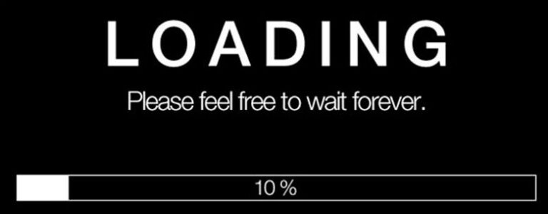
It’s a no-brainer as far as I’m concerned. I won’t wait for sites to load. If they are slow, my finger is on the back button within 3 seconds.
You can also add the SEO factor into this as slow websites will not rank well on Google – that’s a fact according to Moz, who states that Google has indicated site speed (and as a result, page speed) is one of the signals used by its algorithm to rank pages.
Moz makes perfect sense; why would Google rank a site that was delivering a substandard user experience? They wouldn’t as they’ll only deliver results in the SERP’s that offer the best customer experience.
10) Poor call-to-action buttons
Can you believe this statistic: 70% of Small Business B2B Websites Lack A Call to Action, according to Small biz trends.Users need to be able to get to where they want to be on your site. They need to know where to call, buy and sign up. You can’t let them wander around your site without a clear call to actions. Like street signs, they direct people to critical pages throughout the site.If you don’t have clear and distinct call to actions and people are left stranded on your site, expect them to go pretty quickly.
Here are some tips for improving your call-to-action buttons on your site.
i) Use a strong verb in your message to get their attention. With an eCommerce site, use words like ‘buy now’ or free ‘delivery’. These are strong call to actions that prompt users actually to click the button. And, if you’re promoting a service, use words like ‘click here for more information’.
ii) Use words that entice an emotion – be creative with your use of wording such as ‘buy now and get 40% off!” Wording like this triggers powerful buying signals as people love discounts and sales. Also, add an exclamation mark at the end to highlight your point.
11) All hype & no substance
If you have hyped up your home page with fabulous images and promises that do not eventuate, people will exit the site. Many eCommerce sites will promise things like free delivery and guarantees on their products, but once you drill in and explore these further, they don’t live up to this. It’s a massive turn off and is a huge reason people don’t buy from the site.Be honest and upfront, and don’t oversell. Many businesses are guilty of this by using clickbait titles and heading to engage users. Bold headings, exaggerated promises are all part of the clickbait ethos, and it’s rampant online. Don’t be part of this trend if you want to keep customers loyal.
12) Your site isn’t responsive.
Oberlo tells us that: as of February 2021, 55.56 per cent of all web traffic comes through mobile phones. If you have to read that number again, do it and note that this figure will only grow. All you need to do is look at people and see what they are doing. They all have their heads down, looking at their phone. And they are all browsing the internet or on social media. Catering to this market in 2021 and beyond is a must to drive sales and capture a mobile audience. Therefore your site has to be mobile responsive and offer these mobile users a fantastic, seamless online experience.Google even tells us that they now mobile responsive sites are a massive ranking factor in their ‘rolling out the mobile-friendly update‘. Having a responsive site is a win-win; for your customers and your Google rankings. If you have a WordPress website, all you need is a couple of days with a decent web design agency.
13) Try using exit-intent technology.
Have you been on a website lately, and just before you were about to exit, a popup window appeared with a promotional offer? These popups are known as exit-intent technology and are a great last attempt to keep users on your site. Think about employing this great bit of technology and see if engagement or sales levels increase.Campaign Monitor is bullish about this technology, and here are a few things they have to say:
- Email list growth: exit-intent popups that ask for an email address can encourage 4% to 7% of your site visitors to join your list. That could lead to two new email addresses for every 100 site visitors.
- Improved conversion rates: average conversion rates are 3.09%, but the best popups can have conversion rates from 10% to 60% if you optimize them properly.
14) Your website’s been hacked
OMG, this is the absolute worst and will drive anyone away from your site in less than a second. Hacked sites with adult images or links to gambling sites are horrible. And ACS tells us that Australia is one of the world’s most hacked countries. So, the best way to avoid hacking is to engage a company to monitor your site against hacking and update your WordPress plugins frequently.
Conclusion
Just because you have noticed a decrease in sales leads from your website, this doesn’t mean that you can’t fix the problem. The above are helpful tools and tips to help you repair your site’s user experience, SEO rankings, and website performance. While some of these may or may not apply to your websites circumstances, areas like the design and graphics of the site are a pretty common problem that needs addressing. Even if you feel your site is working well, you should give it an audit as there are always areas for improvement.