20 logos that inspire us as a graphic design agency

What makes an inspiring, consumer-focused and attention-grabbing logo?

A truly classic logo is powerful, recognisable and stands the test of time. A logo helps create an image for your company and should reflect what your company is about; its personality, core values and ethos.

In a world where companies are fighting for the consumer dollar, it’s essential that your businesses logo presents something unique.

As a graphic design agency, logos that inspire us are the ones that are iconic and engage the audience immediately. The logo is the first that customers see when they interact with your brand, so it’s no coincidence that some of the biggest and best brands in the world have the best and most aspiration logo designs.

There is no easy answer as to what kind of logo is the best or most effective, but it would be fair to say that the most creative designs catch our eye and inspire us to create.

Logos can consist of symbols and icons, but the text is also important and you can be just as creative with it. Most logos communicate an idea, an idea of what your company is about. Logos can be simple yet create a bold statement or can be a playful pun on your business name. Whatever it may be, logos that inspire us as designers represent the company in the best possible means and leave us with a long-lasting impression of that company.

Below are the logos that inspire us and really push us to create great identities, brands and logos for our clients.


  1. Nike (Swoosh Mark)

The swoosh is a corporate trademark, originally designed by Carolyn Davidson while she was studying graphic design at Portland State University.

inline_699_https://hoppingmad.com.au/wp-content/uploads/2015/09/blog_0004_Nike_Swoosh_Logo_Black_original-1.jpg


  1. Boundary

The boundary is a performance monitoring solution for data networks, the continuous line between the letters is both visually appealing and conceptual.

inline_477_https://hoppingmad.com.au/wp-content/uploads/2015/09/blog_0010_Boundary.jpg

  1. BarCode

A fun play on the name of the brand, the logo is recognisable and you get an idea of what the brand is even without the wording below.

inline_669_https://hoppingmad.com.au/wp-content/uploads/2015/09/blog_0011_bar-code-logo-design.jpg

  1. Air BNB

Created around the concept “Belong Anyway” the logo encompasses a heart with a map pin icon.

inline_875_https://hoppingmad.com.au/wp-content/uploads/2015/09/blog_0013_airbnb.jpg

  1. Mastercard

Simple design, that is easily recognisable. The interlocking circles show strength and the dynamic colours are recognizable.

inline_319_https://hoppingmad.com.au/wp-content/uploads/2015/09/MASTERCARD.jpg


  1. Penguin Books

The logo works for its simplicity and repetitive use over time. The penguin is distinct, and easily recognisable and has become synonymous with books.

inline_886_https://hoppingmad.com.au/wp-content/uploads/2015/09/blog_0002_penguin-logo.jpg

  1. Adidas

The iconic trefoil is mean to represent the continents America, Europe and Africa and the three intersecting lines representing diversity. The three lines have become key in branding, and although simple, they’re easily distinguished.

inline_348_https://hoppingmad.com.au/wp-content/uploads/2015/09/blog_0014_adidas-logo.jpg

  1. Chevron

Using the V shape to reference military history, the brand has embedded itself in American culture.

inline_356_https://hoppingmad.com.au/wp-content/uploads/2015/09/blog_0009_Chevron-logo.jpg

  1. BP

Created with a strategic rebrand in mind, the sunflower represents the energy of the sun and the use of the colour green shows the brands environmental consciousness. The simple shapes are what works best for this brand.

inline_131_https://hoppingmad.com.au/wp-content/uploads/2015/09/blog_0017_BP.jpg

  1. MTV

The distinctive M was originally a sketch, with the ‘tv’ being spray painted. The relaxed, rough nature of the logo makes it accessible and relatable.

inline_800_https://hoppingmad.com.au/wp-content/uploads/2015/09/blog_0015_2000px-MTV_Logo_2010.svg_.jpg

  1. Puma

The Puma logo is a sign of courage and athleticism, encompassing the nature of competition.

inline_164_https://hoppingmad.com.au/wp-content/uploads/2015/09/blog_0001_Puma_Logo.jpg

  1. Fedex

The bold colours, clear type and clever use of negative space to create the arrow make this logo work.

inline_739_https://hoppingmad.com.au/wp-content/uploads/2015/09/blog_0007_fed-ex.jpg

  1. Circus of Magazines

Visually stimulating, clever use of negative space while avoiding clichés.

inline_119_https://hoppingmad.com.au/wp-content/uploads/2015/09/blog_0008_circus20of20magazines.jpg

  1. uBear

Another interesting use of negative space, while maintaining a strong graphic the doesn’t immediately make you think of a teddy bear or something childish.

inline_375_https://hoppingmad.com.au/wp-content/uploads/2015/09/blog_0000_UBear.jpg

  1. Oz Harvest

Oz harvest logo is interesting in the sense that it doesn’t follow a conventional logo form, is increasingly busy and breaks most design rules, but it works, its memorable and definitely shows you what their brand is about.

inline_393_https://hoppingmad.com.au/wp-content/uploads/2015/09/blog_0003_ozharvest_logo_detail1.jpg

  1. Curvature

Interesting play on the name, will make a simple logo stand out. Although the wording isn’t completely legible, your mind fills in the gaps.

inline_950_https://hoppingmad.com.au/wp-content/uploads/2015/09/Curvature-logo.jpg

  1. Made in Britain

The logo immediately makes you think of the Union Jack – the most recognisable British symbol. When you look at this logo the brand is aligning itself with that of Union Jack. A play on something so recognisable works this brand and the simplicity has ensured its longevity.

inline_990_https://hoppingmad.com.au/wp-content/uploads/2015/09/blog_0005_MadeInBritain.jpg

  1. American Table

A simple reflection of the brand and a well thought out way to combine the A and the T.

inline_382_https://hoppingmad.com.au/wp-content/uploads/2015/09/blog_0012_american-table-logo.jpg

  1. Six 3 Nine

A clever combination of shapes and use of clear space. The combination of text and number makes this particularly interesting.

inline_18_https://hoppingmad.com.au/wp-content/uploads/2015/09/blog_0016_639-01.jpg

  1. Killed Productions

A clever play on the company name leaves it up to the customer to decide which other letter has left the I for dead.

inline_177_https://hoppingmad.com.au/wp-content/uploads/2015/09/blog_0006_killed_lg.jpg

I am updating this blog on 10 May 2021 by adding 3 more logos that are current today and stand out as great logo and graphic design example.

1)Australia new Trade logo


inline_26_https://hoppingmad.com.au/wp-content/uploads/2015/09/logo-designs-for-2020.jpg

According to CNN this now looks like a virus and in the world of COVID is this really a great design? Let’s leave it up to you to decide.

2) NRMA Parks & Resorts

inline_81_https://hoppingmad.com.au/wp-content/uploads/2015/09/best-logos-for-2021.jpg

NRMA Parks & Resorts logo is clean, simple yet easy to recognise for people wanting to travel around Australia.

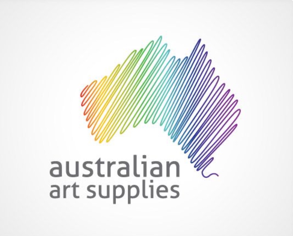
3) Australian Art Supplies
inline_420_https://hoppingmad.com.au/wp-content/uploads/2015/09/best-australian-logos-2021.jpg


7 Effective Ways to get a AWESOME Google Places Ranking

What is Google places?

It’s a listing on Google that shows local listings based on your particular geographic location. It’s a very powerful marketing tool especially for those suburban based local businesses looking to attract the local market. So for example, if I am looking for a locksmith in Paddington, Sydney, Google places will deliver a set of results of locksmiths that are located in the Paddington area or very close by. If there are no locksmiths in the Paddington area( highly unlikely) then the results will expand out to a larger geographic area, say Bondi.

Ideally you want to use a local service or product providor and Google places certainly delivers on this.

What are the benefits of Google places?

  • it’s absolutely free and you don’t have to outlay large sums of money to the likes of Yellow Pages anymore to get a listing. As most small businesses know Yellow pages online ads can be a heavy monthly expense which is something you don’t want to keep paying. It’s best to ( if you have a marketing budget) put this into a SEO campaign.
  • If your Google places listing has been set up properly it should get to the first page of Google which is where you want your business to be. Don’t make the mistake of stuffing this up and forgetting about it. This won’t correct itself.
  • Google places will show a lot of important information for local clients. Name, address, web URL as well as customer reviews. This is a fantastic marketing tool and will bring in heaps of local clients.
  • Mobile phone users on the go can get access to your listing and get to your shop, office, warehouse or factory really quickly with a prominent places listing.
  • Google have given you the opportunity to have another organic listing so make the most of it. You don’t want your competitors to be there without you. Remember the 1 in 4 searches are local based.


Tips for getting your website higher on Google places.

If you want a better Google places ranking, do this now:

Have you set your business profile on Google Places- all you need to do is create a Google account, which is super easy to do. Once you have this all you need to do is login to Google places and they will guide you through the rest. They will send you a verification code ( via mail or phone) and once received, put it in and voila….you have a Google places listing.

Make sure you start your citations- For those of us that have no clue about a citation, it’s a mention or referral from another website to your website. Call it a back link if you will. This should be done on other free directory websites like: Yahoo, Hot Frog and reach local. Make sure the information you provide these directory sites is exactly the same as the ones you provided for places. They will need to verify this so the whole process can take a few weeks. Again, be really selective with the number of directories you submit to. Do not for 1 minute think that registering 1000 times on different directories will help. It’s just a spam and can work against you. We come across many business that fall foul of Google due to this type of SEO technique. What ever you do never ever go with a SEO company that relies only on this method for your SEO or local Google places listing – it’s a recipe for real trouble.

Keep link building local – If you can have your website listed on other local websites this will help with your listing. Local blogs are a good start. Perhaps even local government websites that offer space for advertisers are a great way to improve your local listing profile.

Get reviews- This is a tough one as you need to get as many legitimate reviews as possible and they all should be positive. Google will start pushing your local listing if there are reviews posted, so whatever you do make certain that you can get at least 5 to 10 reviews from different people from different IP addresses ( this is more natural). Fake reviews ( as is so common a practice can be spotted a mile away) – keep it real, honest and updated and Google will reward you. Don’t think that 500 all 5 star reviews will not get picked up as somewhat fake. I have seen this, it does happen and it’s not going to help your business.

There are companies out there who seriously depend on their listing on Google. If you are one of these an cannot seem to make it work for you, please speak with us and we will not only get your places listing right but also look at your entire organic Google rankings. These are the things that are going to have a significant impact on your sales leads and organic web traffic, so if you have seen a drop in online inquiries do something about it today.


15 gorgeous landing pages that are conversion focused

Conversion is key and it comes down to design.

It’s all well and good to have thousands of unique visitors to your website each month, but how is that converting to sales and the success of your business. Does the site keep you hooked? Does it make it easy for you visitors to engage? Is the site sticky? Are there too many hurdles in the way of the buying process? Are you bounce rates way too high? The moment someone stumbles on to your page, they should know within a few seconds what your website is about and what they can get from it. Basically, it’s got to sell, sell, sell!

Effective conversion comes down to great web design and a well thought out user interface, so we’ve put together a list of our favourite sites that are designed to convert browsers to paying very happy customers.


Airbnb

Since their brand refresh, there has been and inherent focus on community, keeping the romance alive with customers and attracting repeat conversions.

The messaging is clear, as it answers how it works and asks you where you want to go.

inline_467_https://hoppingmad.com.au/wp-content/uploads/2015/09/shutterstock_193745936_0002_Screen-Shot-2015-09-02-at-1.41.09-PM.jpg

inline_715_https://hoppingmad.com.au/wp-content/uploads/2015/09/shutterstock_193745936_0001_Screen-Shot-2015-09-02-at-1.41.58-PM.jpg

inline_19_https://hoppingmad.com.au/wp-content/uploads/2015/09/shutterstock_193745936_0000_Screen-Shot-2015-09-02-at-1.41.42-PM.jpg

Bali Villa Escapes

This works in a similar way to airbnb, the imagery gives a sense of what its about, and the booking functions are the clear and simple. You want the user to be able to find a villa easily and quickly and this search box facilitates this. Large images combined with easy booking instructions makes this site a great user interface example.

inline_471_https://hoppingmad.com.au/wp-content/uploads/2015/09/blog_0006_Screen-Shot-2015-09-02-at-1.49.15-PM.jpg

inline_765_https://hoppingmad.com.au/wp-content/uploads/2015/09/blog_0005_Screen-Shot-2015-09-02-at-1.49.25-PM.jpg

Under Armour 

Boasting their star ambassador Stephen Curry, this site makes it easy to fill up your shopping cart.

inline_466_https://hoppingmad.com.au/wp-content/uploads/2015/09/blog_0008_Screen-Shot-2015-09-02-at-1.50.27-PM.jpg

inline_76_https://hoppingmad.com.au/wp-content/uploads/2015/09/blog_0007_Screen-Shot-2015-09-02-at-1.50.37-PM.jpg

Cienneny

Typography has become bigger and bolder in web design and by taking a minimal approach, Cienne cuts straight to the point.

inline_739_https://hoppingmad.com.au/wp-content/uploads/2015/09/blog_0010_Screen-Shot-2015-09-02-at-1.50.53-PM.jpg

inline_992_https://hoppingmad.com.au/wp-content/uploads/2015/09/blog_0009_Screen-Shot-2015-09-02-at-1.51.04-PM.jpg

 Take it App

Bright bold visuals and the magic word, “Free” draw your eye in and youre downloading from the app store before you even scroll down.

inline_342_https://hoppingmad.com.au/wp-content/uploads/2015/09/blog_0013_Screen-Shot-2015-09-02-at-1.51.15-PM.jpg

inline_506_https://hoppingmad.com.au/wp-content/uploads/2015/09/blog_0012_Screen-Shot-2015-09-02-at-1.51.23-PM.jpg

inline_748_https://hoppingmad.com.au/wp-content/uploads/2015/09/blog_0011_Screen-Shot-2015-09-02-at-1.51.30-PM.jpg

Get Harvest

Harvest creates eye catching contrast between the top navigation and draws your eye in to the “Try Harvest for free” button

inline_276_https://hoppingmad.com.au/wp-content/uploads/2015/09/blog_0015_Screen-Shot-2015-09-02-at-1.51.50-PM.jpg

inline_421_https://hoppingmad.com.au/wp-content/uploads/2015/09/blog_0014_Screen-Shot-2015-09-02-at-1.52.08-PM.jpg

Dropbox Guide

Clear and simple use of iconography and prompts to get started.

inline_401_https://hoppingmad.com.au/wp-content/uploads/2015/09/blog_0016_Screen-Shot-2015-09-02-at-1.52.28-PM.jpg

Spotify Taster Rewind

Strong typography and entertaining content, make it too easy to click back in time and share your discoveries.

inline_834_https://hoppingmad.com.au/wp-content/uploads/2015/09/blog_0018_Screen-Shot-2015-09-02-at-1.52.36-PM.jpg

inline_589_https://hoppingmad.com.au/wp-content/uploads/2015/09/blog_0017_Screen-Shot-2015-09-02-at-1.54.09-PM.jpg

Litmus

Similar to the Harvest website the contract between the main navigation draws you to get started now.

inline_921_https://hoppingmad.com.au/wp-content/uploads/2015/09/blog_0020_Screen-Shot-2015-09-02-at-1.54.43-PM.jpg

inline_3_https://hoppingmad.com.au/wp-content/uploads/2015/09/blog_0019_Screen-Shot-2015-09-02-at-1.54.55-PM.jpg

Genius

With bold colours and a strong call to action Genius makes it all to easy to browse the worlds biggest collection of song lyrics.

inline_297_https://hoppingmad.com.au/wp-content/uploads/2015/09/blog_0022_Screen-Shot-2015-09-02-at-1.55.01-PM.jpg

inline_84_https://hoppingmad.com.au/wp-content/uploads/2015/09/blog_0021_Screen-Shot-2015-09-02-at-1.55.12-PM.jpg

Rdio

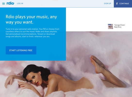
With strong prompts to sign up and engaging icons, and long scroll makes Rdio an easy choice for your music needs.

inline_407_https://hoppingmad.com.au/wp-content/uploads/2015/09/blog_0024_Screen-Shot-2015-09-02-at-1.55.21-PM.jpg

inline_267_https://hoppingmad.com.au/wp-content/uploads/2015/09/blog_0023_Screen-Shot-2015-09-02-at-1.55.29-PM.jpg

Google Ideas

The use of strong contrast and engaging images captivates users and gives them a strong sense of what the site is about.

inline_894_https://hoppingmad.com.au/wp-content/uploads/2015/09/blog_0026_Screen-Shot-2015-09-02-at-1.55.37-PM.jpg

inline_758_https://hoppingmad.com.au/wp-content/uploads/2015/09/blog_0025_Screen-Shot-2015-09-02-at-1.55.48-PM.jpg

Uber

The site makes it clear how the service works, easy for you to sign up and explore other aspects of their business.

inline_961_https://hoppingmad.com.au/wp-content/uploads/2015/09/blog_0001_Shape-2.jpg

inline_803_https://hoppingmad.com.au/wp-content/uploads/2015/09/blog_0000_Screen-Shot-2015-09-02-at-2.03.11-PM.jpg

Dr Pico

Clever imagery and parallax scrolling, give the service an edge with simplicity, combined with clear call to action. Plus the site is extremely SEO friendly.

inline_882_https://hoppingmad.com.au/wp-content/uploads/2015/09/blog_0003_Screen-Shot-2015-09-02-at-2.03.42-PM.jpg

inline_816_https://hoppingmad.com.au/wp-content/uploads/2015/09/blog_0002_Shape-1.jpg

Polyvore

Displaying trending pieces, makes signing up and online shopping a breeze with perceptible sales and community growth.

inline_98_https://hoppingmad.com.au/wp-content/uploads/2015/09/blog_0004_Screen-Shot-2015-09-02-at-2.04.14-PM.jpg
The worst thing that can happen to your website is consumers abandoning your website once they find it. It’s like having an ugly shop front with rude staff. It’s just a no go zone. You can have your shop in the busiest retail strip with 1000’s of passing people each day BUT if they don’t like the look of the entrance or window display they will never come in. Same goes for your website.Page 1 on Google is great but if they are not buying from you then there are on site web issues that must be fixed immediately to fix these problems.

If you are looking to get a website designed that will be extremely focused on getting those people who land on your website to actually buy from you then speak with us. We will make sure that all your web pages are geared towards making that sale.