Conversion is key and it comes down to design.
It’s all well and good to have thousands of unique visitors to your website each month, but how is that converting to sales and the success of your business. Does the site keep you hooked? Does it make it easy for you visitors to engage? Is the site sticky? Are there too many hurdles in the way of the buying process? Are you bounce rates way too high? The moment someone stumbles on to your page, they should know within a few seconds what your website is about and what they can get from it. Basically, it’s got to sell, sell, sell!
Effective conversion comes down to great web design and a well thought out user interface, so we’ve put together a list of our favourite sites that are designed to convert browsers to paying very happy customers.
Airbnb
Since their brand refresh, there has been and inherent focus on community, keeping the romance alive with customers and attracting repeat conversions.
The messaging is clear, as it answers how it works and asks you where you want to go.

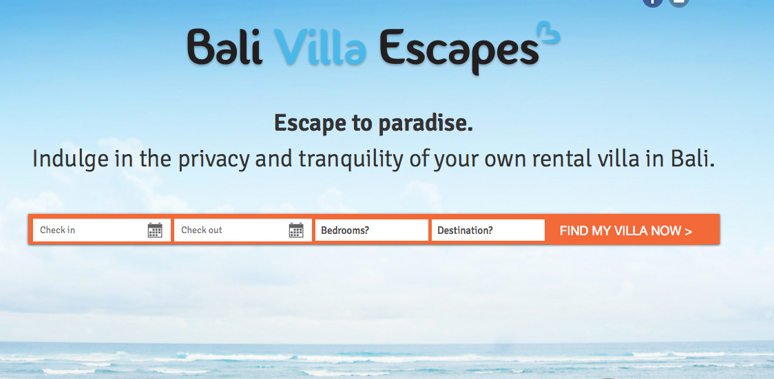
Bali Villa Escapes
This works in a similar way to airbnb, the imagery gives a sense of what its about, and the booking functions are the clear and simple. You want the user to be able to find a villa easily and quickly and this search box facilitates this. Large images combined with easy booking instructions makes this site a great user interface example.
Under Armour
Boasting their star ambassador Stephen Curry, this site makes it easy to fill up your shopping cart.


Cienneny
Typography has become bigger and bolder in web design and by taking a minimal approach, Cienne cuts straight to the point.


Take it App
Bright bold visuals and the magic word, “Free” draw your eye in and youre downloading from the app store before you even scroll down.


Get Harvest
Harvest creates eye catching contrast between the top navigation and draws your eye in to the “Try Harvest for free” button


Dropbox Guide
Clear and simple use of iconography and prompts to get started.
Spotify Taster Rewind
Strong typography and entertaining content, make it too easy to click back in time and share your discoveries.


Litmus
Similar to the Harvest website the contract between the main navigation draws you to get started now.


Genius
With bold colours and a strong call to action Genius makes it all to easy to browse the worlds biggest collection of song lyrics.


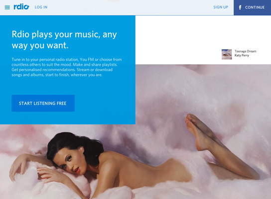
Rdio
With strong prompts to sign up and engaging icons, and long scroll makes Rdio an easy choice for your music needs.


Google Ideas
The use of strong contrast and engaging images captivates users and gives them a strong sense of what the site is about.


Uber
The site makes it clear how the service works, easy for you to sign up and explore other aspects of their business.


Dr Pico
Clever imagery and parallax scrolling, give the service an edge with simplicity, combined with clear call to action. Plus the site is extremely SEO friendly.


Polyvore
Displaying trending pieces, makes signing up and online shopping a breeze with perceptible sales and community growth.

The worst thing that can happen to your website is consumers abandoning your website once they find it. It’s like having an ugly shop front with rude staff. It’s just a no go zone. You can have your shop in the busiest retail strip with 1000’s of passing people each day BUT if they don’t like the look of the entrance or window display they will never come in. Same goes for your website.Page 1 on Google is great but if they are not buying from you then there are on site web issues that must be fixed immediately to fix these problems.
If you are looking to get a website designed that will be extremely focused on getting those people who land on your website to actually buy from you then speak with us. We will make sure that all your web pages are geared towards making that sale.


