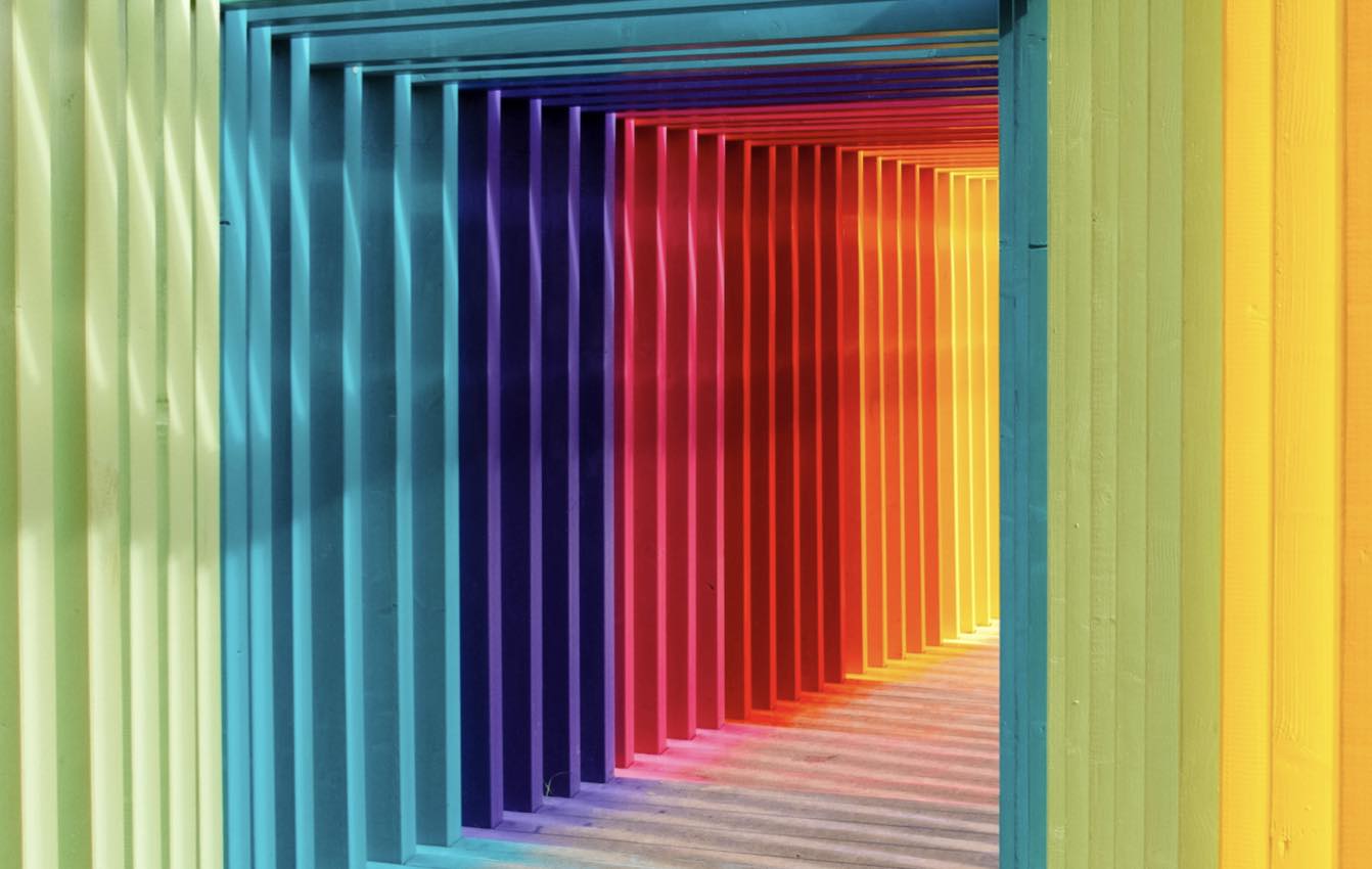
Colour psychology is a study of how colour affects perceptions and behaviours. It is a very complex theory that has not yet been analysed enough. Because of the lack of information and knowledge, it’s difficult to use in the right way in marketing and branding. In marketing, we use colour psychology to focus on how the colours impact consumers’ impressions of the brand and to persuade consumers to make a purchase and consider the brand. It’s a very important field to consider when creating marketing strategies and assets, such as building a new business or rebranding one.
It’s difficult to connect colours with certain feelings and emotions that arise when seeing one because it is too dependent on personal experience. To choose a colour for your brand is not an easy task, because you have to take the feeling, mood, and image of your brand into consideration. In other words, question yourself does the colour fit for what you are selling. Below, you will see how colour can be properly applied in marketing and branding.
The Colour Blue
The colour blue is known for its trust and dependability. It is a colour that is reliable, responsible and mentally soothing. It’s considered as one of the most-liked colours in the world. We can see blue everywhere in the marketing space because it can evoke a wide span of emotions in consumers. It’s a colour used by many favourites and popular brands like Facebook, Twitter, and companies like Samsung, IBM, Visa etc. Blue is in the cool spectre of colours, so it evokes emotions of professionalism, authority and trust. That’s why political parties use the colour blue.
Choosing a shade also matters. Each shade conveys different emotions, so it’s essential to give it a lot of thought. Colours also play a key role in directing users’ attention. If you are using blue on your website strategically it will tell visitors how to feel about certain information and your brand. Having a bright shade of blue on a light background such as a call to action will make it stand out. Using a blue shade as a call to action colour will ask for trust from the consumers, making them more open to using your product. Consider that if using blue in equal amount with a contrasting colour like orange, can create a lot of visual noise, making your viewers overwhelmed.
The Colour Purple
Purple is a very strong colour, and very often it divides people, who either love it or hate it. There are numerous ways to use purple in marketing, depending on which emotion you want to portray. Purple is also often associated with women and femininity. It’s known that women generally like purple more than men do. This colour has been used with some very powerful women’s causes like the Women’s Liberation movement. International Women’s Day also used a rich purple for its logo. Purple is historically associated with achieving gender equality.
Purple rarely appears in nature, making it a primarily artificially made dye. In Roman times, it was worth more than its weight in gold and was only worn by Roman emperors. Because the supply was limited, it was associated with extreme wealth, making kings and queens adopt it as a noble colour. It is also connected with something out of this world, symbolising peace and wisdom in Hinduism for example. Creativity and imagination are tied to purple because it is not found in nature as much. Using purple in your marketing will convey a message of mystery, luxury and creativity.
The Colour Red
Red is considered the most emotionally intense colour, symbolising importance, intensity and excitement. It draws attention and draws the eye’s focus making things more noticeable. It is also a colour that creates a sense of urgency, which comes in handy when making sales. Depending on your brand and what you are selling, consider carefully whether you should use red in your designs or marketing. It’s a passionate colour, which is why it’s used on cars and lingerie. Using it a little bit is an effective way to make important words and information stand out, but when used too much, it becomes overwhelming.
The famous brand Coca-Cola uses red for its logo, advertising and packaging. We’re all familiar with popular drinks and the colour we associate with them. A lot of fashion brands use it, like H&M and Levi’s, Target and design software company Adobe. It’s a colour that encourages appetite, so it’s used in fast-food companies like KFC and Chick-fil-A, and manufacturers like Heinz, Red Bull etc.
The Colour Orange
Orange represents fun, energy and ambition. It’s connected to the sun like yellow, giving it a feeling of warmth and radiance. It’s a great colour for a non-corporate brand. When using a darker shade of orange, it’s connected to autumn and earthy feel. If your company is energetic or you sell those types of products, orange is the colour for you. It’s a very playful colour so it’s used frequently in brands for children, like the TV channel Nickelodeon. It’s used by Amazon, the biggest shopping website. Since it represents energy, Harley-Davidson motors use it as the colour for their logo.
It combines colour red’s energy with the friendliness of yellow. It is a great colour for bringing comfort and a sense of fun. It is also a perfect accent colour, especially when used with the contrasting colour blue as a background, as it makes it pop out. If you need a call to actiob on your primarily blue website, orange is the perfect solution. A well-accentuated use of orange on a properly designed website can attract consumers towards what you’re aiming for. Use it wisely, because a lot of orange colour can overwhelm the consumers.
The Colour Yellow
Yellow signifies warmth, optimism, and cheerfulness. It is a symbol of happiness and laughter. It is a colour that is rarely used alone. When used too much it can be overpowering and feel too bright to the eye, so try to use it to highlight certain things that need to stand out. It’s most commonly used in the food industry, like McDonald’s and Burger King, and the auto industry like Ferrari and Chevrolet. Many powerful companies use yellow in their logo and branding, like construction company CAT, delivery service DHL and camera company Nikon. If you want to increase confidence, provide inspiration or lift someone’s spirit, use yellow in your design and marketing. It’s also a colour used in shops’ windows, for sales and new collections, attracting buyers.
The Colour Green
Green is a colour of balance, harmony, and nature. It has a balance of logical and emotional, giving us a sense of the right choices. It is the most common nature colour, representing life, rest and peace. It is a sign of growth, with nature like plants or our income and wealth. It is a very easy colour on the eyes. If your business has nature and sustainability focus, green is the perfect colour for your branding and marketing.
It’s a colour used for recycling symbols and other symbols that represent nature and taking care of it. The colour represents life, so companies that promote health and nature, like the TV channel Animal Planet, use it. Since it is connected to wealth and money, it can be used if you are trying to sell certain products or show ways to increase the wealth of your consumers. It can have negative aspects like over-possession and materialism, so use it in moderation.
The Colour Black
Black is not on the colour wheel, as it is viewed as an absence of light. But we see it and use it very often. It is a very powerful colour. Black is considered a neutral colour, often used to stabilise or subdue vibrant colours. It is associated with elegance, formality, modern and luxurious. If you sell high-end, luxury items, black is the colour to use in your branding, especially websites. When used with white it creates a contrast, making users focus on product photos and vibrant accents. Too much black can seem grim and uninviting. It has a very functional design aesthetic, making it a very easy colour to incorporate in design and marketing in business.
It’s a colour used in printing publications, giving it a serious note that you can translate to the online world. It’s used in very successful brands and marketing like Apple, Gillette and Chanel. It is a colour used boldly and to make an impact while remaining modern or traditional, depending on the typography used. Using black in already dark colours in counterproductive. It strains the eye and reduces readability.
Conclusion
Whichever colour you choose, be careful and take into consideration how it affects the users that see it and your brand. Will it give you a fun and inviting feeling or give an edge? Or will it be calming when used with blue or green? Take into consideration what your brand is about and what message you want to send to the consumers and then you will see what colour is perfect for you. Use complementary colours to enhance important buttons and information, but use it sparingly to avoid making the user overwhelmed.
