As the saying goes, you learn from your past mistakes.
With that in mind, you need to look at all your previous web design mistakes, so you never repeat them, which includes your websites checkout page.
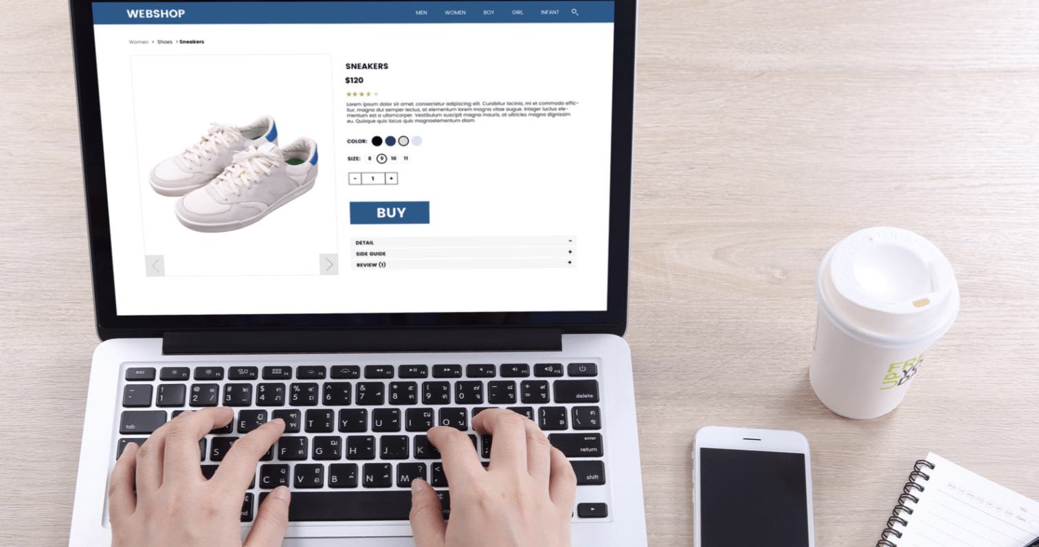
If you have an eCommerce website, your checkout page design can be the difference between making the sale or a consumer exiting the shopping cart. It’s the place where you have one last chance to convince buyers to hit that pay now button.
I bet you didn’t know that over 60% of people abandon their shopping cart on the checkout page. An alarming statistic if you want to help improve conversion rates. With this fact in mind, you have to make your checkout page the most robust and sales driven page on your website.
Following are some definite no-no’s regarding the design of the checkout page of your eCommerce website.
1) Not recommending other products
An eCommerce website without other product recommendations is like a salesperson not telling you about other great products they may have. It’s not a good idea. So, at the checkout page ( preferably near the bottom of the page ), make a few alternative product recommendations. Then, when they are at the checkout page, they have their wallets open with their finger on the buy now button, which is the ideal time to showcase a few of your other great products. If you don’t do this, you might be missing more sales and cross-pollination of different products, which is a definite no-no!
2) Strong Call To Action Buttons Highlighting the CheckOut Page
Like the sales desk in a shop, you can see the cash register where you pay. The same goes for the checkout page. There need to be strong pathways signals highlighting this page. You never want your customers to be wandering around your site, getting lost and not being able to find the checkout page button immediately. For this, you need clear, strong graphics. Essentially, if they cannot see this button, they will exit the site in frustration only to give their business to your competition. Placing a big, bold square at the top right-hand corner of the page with the words ‘check out’ is an excellent option as it’s obvious. So, every time you add an item to your basket, you can quickly go to the checkout page to see the total cost.
3) Have a live chat feature
Many customers won’t trust your website unless it’s a well-known brand or household name. I mean, why should they give you their details and pay for a product from you? You must be able to show a level of human interaction to help them trust you more. A great way to achieve this is to add a chat feature on the site. It’s so common nowadays that it may raise a few red flags if it’s not on the site. There are loads of chat features you can quickly install. And, if you cannot watch this 24/7 like most small businesses, most chat features will have the functionality to allow customers to leave a message.
4) Highlight security features
People shopping online can become very nervous a couple of seconds before they hit the buy now button. This is because many scammers, hackers, and dodgy sites online masquerade as credible sites, mistrusting the buying public. Placing a security icon front and centre of the checkout page will add a certain level of buyer security. Now I’m not saying this is a full-proof method, but it’s just one more in your arsenal that you can use to add an extra layer of trust.
5) Add positive reviews
Nothing sells harder than a few positive reviews from customers. So ensure your checkout page has some customer product reviews to help build trust in both their prospective purchase and your website. And according to Forbes, online reviews have been shown to impact 67.7% of purchasing decisions.
6) Have a rating system
Is the product decent, good, worthwhile to buy, and is it amazing? Place stars based on reviews next to the product so consumers can quickly see how good the product is by the start count. For example, if they see 5 stars next to the product, guess what will happen? They will more than likely hit the buy button.
7) Don’t make them sign up to buy!
Don’t you hate it when you’re at a store, and you want to buy something quickly and ask if you’re a member or would you like to join? It’s the same with any eCommerce shopping check out page; people do not want to go through a lengthy sign-up process to buy an item. The quickest way to lose a good customer at the checkout page is to make them sign up. If you want to capture their information, only ask them to sign up after they have hit the buy now button and offer an incentive for them to do this, such as a discount on their subsequent acquisition. This is one of the most critical aspects of eCommerce web design.
8) Shipping and billing details
Combine shipping and billing details will make it a lot quicker for people to check out and make the purchase. The worst thing you can do is make the billing and shipping details complicated.
9) Limit changes
If the consumer wants to change their mind and edit the shopping cart, they should be able to do this quickly without affecting other items in the cart. If they have to start again due to one change, this will kill the shopping experience. So make it super easy to change items in the cart, whether it’s colours, numbers or even sizes. Plus, if they go back to browsing once they have filled out their details on the form, the system should remember these, so the customer doesn’t have to go through the whole process again.
10) Use heatmaps
While not part of the checkout process, a heat map will allow you to track peoples movements on the checkout page. Knowing what buttons are being clicked on will help you know if the page is conversion-focused or not. Heat mapping is a great way to see if there are enough calls to action and if they are being utilised. It would help if you were using a heat map on all pages of your site, but critical ones such as the check out page are imperative.
Conclusion
There are far too many mistakes you can make on the checkout page of your site to mention. So the best advice I can give you is to keep a few harmful design elements well away from the checkout page. Doing this will dramatically increase your conversion rates, sales and ultimately revenue. Of course, I have not touched on the technical issues such as slow loading pages or check out pages that do not render correctly on a mobile phone, but these quick what not to do’s should point you in the right direction.