What is Branding? The Importance of Branding In Business

Branding is vital for your business.

It’s the first thing potential customers see and the face of your business.

Your branding sets you apart from your competition, and it’s the core of your business, as your branding includes the business name, logo, and the business colours and style. Most people will, over time, recognise your branding and associate certain things with it. A strong, influential brand will leave a lasting impression, however good or bad. But one thing is sure: you need strong branding as a starting point for your business. In today’s saturated digital space, you will need a logo professionally designed by some good graphic designers who know the Sydney market if you’re going to have cut-through and be heard among all the online noise. From small start-ups to online eCommerce stores to tradies needing branding for their trucks, a brand is the first step in achieving business success.

Branding is critical

According to HubSpot, A brand is the identity and story of a company that makes it stand out from competitors that sell similar products or services.

You would be surprised by how much a strong brand can resonate and stay in a person’s mind. Big companies such as Apple, Coca Cola and Unilever understand this, and they will go to extraordinary lengths to protect their brand and name. Whilst your business may be small, it still needs a solid visual identity and name that people can identify with and want to be part of. People love being associated with brand names; it forms part of their makeup and personality. Think Lulelemon, RipCurl, Apple, Speedo and Nike. Consumers buy their products not necessarily for the product but for the branding and being able to showcase it, whether they are wearing it or typing on it. A brand creates a sense of loyalty and pride, which people become very attached to and never leave, so you have to consider branding a vital part of your business from the start. If you are intelligent and willing to invest in your branding, you’ll soon see why (later down the track as the business evolves ) this was such a smart decision. Sure, you can tweak and fine-tune your branding later on, but it’s much easier to do it right from the beginning and build upon the branding in all your communication material.

The Role of a Graphic Design Agency in Business Success

A graphic design agency is super-critical in helping businesses establish their brand, design it and help integrate it across all marketing channels. An established design agency can look at the business and its competition and develop branding design options that separate the business from the throngs of other players in the same space. As an astute business owner or budding entrepreneur, you might feel that you have some excellent ideas. Still, a graphic designer will be able to bring a fresh design perspective to this and come up with brilliant branding options that you’ve never thought of. Your designer will (in the first meet-up) be able to get an idea of your company’s values, goals, and vision and translate this into a design that speaks volumes about who you are and what your business represents. From creating a visually stunning logo to implementing consistent brand messaging, a good graphic design agency ensures that every piece of marketing material (whether online or in print) reflects the brand’s core personality.

Hopping Mad Designs: A Leading Graphic Design Agency

When it comes to branding or any graphic design work, Hopping Mad Designs is unique as we are one of only a handful of graphic design studios that can honestly say that we have been around for over two decades. This longevity means that we have designed brands for various businesses and industries. We can use the depth of creative talent and the pool of talent to develop a brand for your business that will stand the test of time and set you apart from your rivals.

How Easy Is it to Start Working with Hopping Mad Designs?

In a word, very easy. We take a collaborative approach to any design or branding project and love to work with our clients in a no-nonsense, no-frills approach that just gets the job done. We take the time necessary to get to know your business, what you’re trying to achieve and the design style you want. But rest assured, we will put on our design thinking caps to come up with some fabulous designs you’ll absolutely love. All you have to do is see some of our Google reviews to see what some of our clients think:) 

Ask us about other services we offer, like animated explainer videos or infographics that can be used to explain your business more clearly and sell your services. They’ll give you the competitive edge and impact you need to break through to your audience.

8 Red Flags to Avoid When Choosing a Logo Designer

Choosing a logo graphic designer to create a new logo or brand for your business or revamp your existing logo can be risky.

After all, this is your logo and your business’s face. You want it to reflect your brand, culture, image and business direction. So who do you trust with this critical task?

In this blog, I’ll look at 8 red flags you need to know about when choosing your next graphic design agency to tackle your rebranding. Knowing what to look out for will save you lots of time and, in many cases, loads of money, and in the worst-case scenario, having a brand or image that’s detrimental to your business or company.

Why choosing the right graphic designer should be done with lots of homework, a few interviews and taking a cautious approach.

Branding or logo design for your business is about something other than throwing a few pretty pictures or images together and hoping it works. Brand development is an emotional bond between the brand and your business. It’s the public face that spells out who you are, what your business represents and how you operate. Your logo is one of the most essential facets of your business, and once you have it, you pretty much have it for the duration of your business. It’s hard to chop and change your logo/brand as it’s pasted all over your marketing and sales material, even your vans, building signage, social media and website. It’s like a tattoo; once it’s there, you have it for the long haul. Changing it is costly, time-consuming and can negatively affect n your business. So making the right choice from the get-go is super important. A visually creative logo reflecting your business is the key to winning loyal customers. Stuffing it up can ruin your brand, image and how the public or your customers view your business. Branding is a massive investment in your business and needs to be taken seriously. The right graphic designer will know what to look out for; they’ll ask all the right questions to get the correct brief, and once they have this information filter it into a logo or brand that resonates with you, your customer base and you’re business.

Why is your logo and brand development significant, anyway?

Strong branding can significantly impact how your audience responds to your product, brand or service. Big names like Virgin, Coles and KFC all have recognisable brands that convey a feeling and personality you identify with. But, remember, there was a time when these brands were in their infancy phase, and they have evolved with the companies to reflect who they are now. They are immediately recognised and create an emotional subconscious connection between the customer and the business. Wouldn’t it be great if your company’s brand also could do this? It’s always lovely when someone looks at your logo and thinks, ‘Wow, that looks good’. They’ll remember the logo and may be more likely to be brand loyal.

Following are a few benefits of creating a credible and solid brand identity or logo for your business.

A credible brand will instil trust.

If your brand looks too cheap n cheerful, what does it say about your business, and what does it say about you as the owner? If it’s messy and slapped together quickly, it doesn’t bode well regarding the trust factor. A dodgy-looking logo is just that, dodgy, and it will reflect poorly on you. On the other hand, a cool, creative, clever logo will instil volumes of trust which is the cornerstone of any business.

Develop brand loyalty with customers.

Customers want to be associated with cool, exciting and vibrant brands. Look at Apple, Lululemon or Rip Curl, for example. People love these brands and are super loyal to them not only because of their great products but because the branding looks impressive. Once you are an Apple user, you’ll never switch. Or once you wear a Rip Curl wetsuit, you’ll wear that badge of honour in the surf for a lifetime. Also, check out the yoga brand Lululemon and how people buy the product because of the logo – they see it as something that sits with their personality. Here the brand and the human connection are genuine.

Build brand recognition

Having an intelligent, catchy well-designed logo helps build brand recognition, so whenever someone sees it, they have a positive emotional response. When I see someone in a Rip Curl wetsuit, I know that person has the best equipment, and I respect that also; if I notice someone wearing Lululemon, I see that they have good taste in clothing. 

Makes your brand stand out from the crowd

It’s a competitive marketplace, and with social media nose added to the equation, you have to have a brand that stands out from the crowd and can cut through to the consumer. A no-brainer, I know, but the more your brand looks independent and unique, the more you’ll stand out from the crowd. After all, you don’t want to look like everyone else. It’s dull, unimaginative and will only be detrimental to your business.

Helps grow your business

You still have to work extremely hard on your business, and a logo is not the golden goose, but it can certainly help you via greater brand recognition, loyalty and trust. All these combined will help grow your business over time.

What are the red flags to look out for when choosing your graphic design agency?

You must look for certain red flags and alarm bells when searching for your next design agency online (and yes, there are many to choose from, especially if you Google Graphic Designers Sydney). Knowing these will help you sort the good designers from the bad ones.

Outsourcing the design work

Many design agencies are just sales machines, and once they have your business will outsource it overseas to a cheap third party. These overseas designers may be ok, but they won’t be local, be able to understand the local market clearly and won’t be the point of contact where you can articulate what you want for your business’s image. We always find that the designer that takes the brief should be the designer working on the logo. They need to get a sense of your business and connect with the owner, and in turn, be able to nail the design brief quickly.

Note: When you work with Hopping Mad Designs, you work with Jo, the senior creative working on the logo. We never outsource and always design in-house in Sydney.

A poor portfolio of previous work

If you scour graphic design websites online, they should show their portfolio online and have various samples of their work across various industries. If they don’t have a substantial portfolio, then this is a huge red flag and could mean that:

  • They are industry newbies and only have a little work to show, which is ok, but they need to convey this to you and charge accordingly.
  • They are not proud of their work and want to show you, OR they have outsourced the previous work, and the quality could be better.
  • All their work is niche and confined to one area, which shows a need for more diversity in their design.

Watch how they present their work online and see if you like any brands or logos in your niche (if they indeed have any). And when you do finally call them, see if they can elaborate on a few case studies and explain how they got to the logo from the brief given. 

Note: Hopping Mad Designs has an ever-growing list of design examples that can be viewed proudly on our website.

Dodgy testimonials and reviews

It’s so easy to buy reviews and testimonials online, so watch out for this. If you see Google reviews that are all positive and from people that are not from businesses or have reviews but nothing concrete in the reviews, then they are disingenuous. I would ask for a few references you can call to see how they respond. This is a good sign if they willingly provide references and all work out. Also, 5-star reviews with no content are absolutely useless and a waste of time. Throwaway lines like ‘great job’ or ‘ top company’ are one-line grabs and worthless. I would also look for case studies on their website to see how the designers developed the final branding and the initial brief.

Note! Hopping Mad Designs receives authentic reviews regularly from clients thrilled with their project outcome. We’re also happy to put you in touch with any of our clients to verify their feedback and the work we have completed for their business.

Missing in action

Don’t you hate it when you engage someone to do work for you and they simply disappear, or it takes a couple of days for them to reply to an email or phone message? Even the busiest design agencies should have the common courtesy to return client calls. Ideally, you should be able to have direct contact with your designer and communicate with them once you receive the initial design options.

Note! At Hopping Mad Designs, you get direct access to speak to the company’s Creative Director and Senior Designer – Joanna Basile. We are always available and will get back to you promptly.

Not asking the right questions.

Your designer must know about your business for a brand or logo to work effectively. To do this, they need to interview you to get the brief and learn things like, your product offerings, specials, goals, customer base and what you like and don’t like about the current logo or what you like about your competitor’s branding. Failing to ask these critical questions means that the graphic designer will either outsource your logo, plagiarise it from another business, or don’t care enough. Some designers will use a cookie-cutter questionnaire; however, at Hopping Mad Designs, we like to have an informal face-to-face meeting to go over all these finer points, so we always nail the brief and develop appropriate designs for our happy clients. We understand the discovery process is crucial to creating a fabulous-looking logo.

They do your logo for free if they are designing your website.

Many people ask us to update their logo as part of their web design package, but we always say no, as a logo or brand is not an afterthought and requires as much effort as a website. Why? Because your logo is the face of your business and is the foundation that every other piece of marketing material or collateral rests on and must be given more attention than any other communication piece. So watch out for the red flag if any graphic designer starts throwing in logo updates to get the deal across the line and win your business.

Note! At Hopping Mad Designs, we know how important a logo is and will never lump it into another design job. Yes, we offer many other design services like explainer videos or annual report design. Still, we will never discuss branding while doing these jobs unless it’s an entirely new job.

They use the design ideas you provided them.

Many business owners are also frustrated designers ( yes, we have seen them), and they all like to present their ideas and interpretations of what they think their logo should look like. They’ll sit at the initial brief, show you all the design ideas they sketched on paper, and expect you to follow them. Any good designer (and this is where the red flags should happen) will stop you there and take your design ideas on board only as a design direction BUT never actually use them. It’s like me telling a doctor how to treat an illness without their input – it’s crazy. If you’re paying for a graphic design, let them do their job without too much interference or input. Sure, give them a brief but let them develop the designs. If they rehash what you have provided, they are not doing their job, and it just shows how inexperienced they are.

Note! At Hopping Mad Designs, we are upfront and honest about everything we do, including the design ideas you present. We will tell you if they don’t work or are in the wrong direction. We never plagiarise your designs and will always come up with our interpretation of what we feel is the appropriate logo/brand.

Shopify or WordPress: Which is Better for your business

Shopify is a powerful all-in-one website builder and eCommerce platform that can be set up in a few minutes. Even if you are a new business startup newbie, you can always contact the 24/7 Shopify team for support and help. If this sounds like your perfect next big business idea solution to help you get online, then Shopify is the way to go! They give you a 14-day free trial to test it out and see if it fits within your business model.
WordPress, on the other hand, is a massive beast and the eCommerce platform integrated is called WooCommerce. Having a WordPress CMS platform and WooCommerce allows you to use all the add-ons that WordPress allows, such as amazing-looking themes and apps and of course, it’s great for SEO

WooComemrce’s technical specs are worth reading before you use its platform. 

WordPress (WooCommerce) Advantages

Free and Open Source: WooCommerce is 100% free and open-source, meaning the entry point for startups and SMEs who are price sensitive is a great option. If the platform is free, it makes it very attractive for those with tight marketing shoestrings. WooCommerce integrates nicely with the popular CMS, WordPress so getting an eCommerce website is easy for most web designers and developers.

100% Customisable: Because you are using WordPress, you have a massive choice of design themes that would fit nicely with your business model. It doesn’t matter whether you are a professional, tradie or startup; there is a theme that you will find that suits your style. You can customise headers, footers, checkout sections, product pages and blogs. Plus, all the plugins are fully customisable, which is brilliant- see the point below. As a Sydney graphic design agency, this is not ideal as SMEs can use a WordPress theme rather than us designing one – but there are limitations to these themes and are only good for small businesses requiring a very basic website that has strict design parameters. I have personally seen many businesses ditch their WordPress themes because of their limitations.

Awesome Plugins: WooCommercie is the eCommerce plugin that converts your basic WordPress site into a fully functional online store. Of course, you will have to add all your products manually (yes, this can be a hassle), but it’s super easy, and most non-tech people will find this easy. There are also handy marketing plugins for those budding entrepreneurial business eCommerce startups to help them get more customers and better Google ranking, such as Yoest SEO (to help examine any extra on-page SEO amendments), WooCommerce MailChimp for email marketing, and WooCommerce Google Analytics to track store performance. How brilliant! 

Dynamic Inventory Management: You can create web stores with WooCommerce to sell physical and digital products. You also have the option to keep adding products regularly and set different product types and product SKUs. Also, WooCommerce makes tracking inventory and stock levels easy, which is perfect if you have many products and a high turnover business.

Mobile-Friendly: People like searching for products on their mobile devices; simple as that. And, WooCommerce and WordPress make it remarkably easy to convert your site automatically into a mobile-friendly responsive site which is perfect for users wanting to buy products on the go. And, because there’s auto inventory management, your customers can quickly tell if the product is available.

Lots of Extensions: You can choose free and paid extensions to suit your business needs if you have a WordPress site. It’s so easy. With the click of a mouse, you can have an added component to your shopping cart without having to go through the hassle of hiring a web developer or graphic designer to style the cart. You also have excellent extension options, such as store management, product pages, checkout (to make the process easier), shopping cart, product search features, payments, shipping, and stock and revenue reporting.

Fantastic SEO features: WooCommerce SEO is about getting your products in front of the consumer. You want to rank on Google if you’re going to sell, and WooCommerce makes it super simple to change titles and descriptions and have them indexed quickly. So now, with WooCommerce, you can start selling more due to their efficient SEO plugins like Yoest.

Safe and secure: WooCommerce has frequent security updates to protect your site from hackers and cybersecurity threats. Businesses need to know that their website is safe online, and they can confidently run their businesses knowing that they are using platforms designed to prevent hackers from stealing information or ripping your site down and extorting you for money. Also, from the consumer side of things, WooCommerce is an excellent plugin as it creates a safe and secure online environment for credit card transactions. 

Multiple Payment Gateways and Currency Support: WooCommerce offers targeted geolocation selling capabilities that enable you to accept various currencies from people worldwide. So, for example, if you are selling from Australia to the US, consumers in the US will have the product displayed in $US and have shipping options calculated instantly. With WooComemrce, you can take your product worldwide.

WordPress (WooCommerce) Disadvantages

Frequent Updates: If you like to be updating your website regularly, then WordPress and WooCommerce are acceptable, but for others, the constant need to update plugins and security patches can become too much effort. Every update comes with time-consuming testing that can add pressure to your busy development team or yourself.

Not Newbie-Friendly: Working out the WordPress CMS can be challenging for many business owners, and adding WooCommerce into the mix makes it a bit harder. With no customer support or anyone to call, you have to rely on online communities for help; for newbies, this is too much. Honestly, if you are a business startup, the whole WooCommerce will be a real hassle; many people throw up their arms and walk away.

Website Speed: Too many plugins will negatively affect the performance of your website. With WooCommerce, you will have to add many new plugins for functionality, but there’s a price to pay for this added super-duper functionalist and website speed and download times. Not to mention the added hosting space you might have to buy. Of course, you can always check your website speed at Pingdom to ensure your site isn’t too slow.

Shopify Advantages

Whizz Bang Designed and Mobile-Responsive Themes: Shopify has ten free and 64 premium themes, starting from AUD$100. Each theme is mobile responsive and will automatically fit all mobile phones, so there’s no stuffing around dealing with developers. All the themes are professionally designed, and you must choose one appropriate for your business. You can be up and running your store online in a couple of hours; that’s the beauty of Shopify.

Best Security: Shopify provides 100% SSL to keep their sites secure, and they hire teams of developers to ensure speed times are super-fast. Shopify is known for fast and safe downloads and understands that online shopping experiences must be flawless. According to CrazyEgg, customers will only wait a maximum of 3 seconds before hitting that back button and leaving your site. There’s another rule called the 15-second rule, and this is the amount of time people spend on your site looking for what they want. If not found within this time frame, they are gone. Shopify, more than any other online platform, knows this rule and is acutely aware of consumer behaviour. So, they make all their site easy to navigate, intuitive and fast! Plus, security is their main priority because you accept credit card payments. So with Shopify, you get speed, security and themes that are customer focused.

In-House App Store: Shopify has an in-house app store as one of its most significant unique selling points that makes Shopify by far the best online platform. You can easily integrate these apps by paying or downloading freebies to help streamline and improve the online customer experience or make your business easier to manage. Managing inventory, stock levels, payment processes, shipping, returns, and special customer discounts can all be handled with these apps.

Your Brand Domain Name: Some CMS platforms do not allow you to have your domain name, but with Shopify, you can have a domain name that reflects your business. It’s super important that your domain name matches your brand/business, and Shopify is perfect for this particular feature.

Great Analytics: You need to measure the performance of your website, and Shopify has excellent analytics that allows you to measure consumer behaviour, pages they are landing on, time spent on the site, popular products, stock levels, conversion rates and more. You can optimise your site for better performance and sales with this knowledge.

24/7 Customer Support: For most business owners, the thought of being able to reach out and get help and support is a comforting fact that enhances Shopify’s appeal even more. You get online chat help, email help and a customer service team that can handle inquiries, troubleshooting or issues.

Scalable: As your online business grows, so will Shopify as your online platform. It can accommodate sudden spikes in web traffic and is robust enough to handle a rapid increase in products on the site. So as you become a major online player, you can always have Shopify by your side and be confident that it can be there for the long term.

Shopify Disadvantages

Transaction Fees: You get a few subscription plans with Shopify, but the basic plan is precisely what it says; elementary. Greta for super-small eCommerce sites but anything more significant and you will have to start dishing out the Mulla. And while Shopify does support multiple payment gateways, if you don’t use Shopify Payments, you’ll have to pay an additional transactional fee on top of the payment processor fee (PayPal or Stripe). So, you are locked into using the Shopify payment gateway, and while that might be OK, you might want to use alternative methods. 

A tad complicated: Shopify, although it has a customer support team, has a steep learning curve, and you’ll have to practice your Shopify techniques before you fully understand all its nuances. Most people will get their heads around it, but it may be hard for others. And the jargon they use for the consumer is tricky and offbeat. A great example is instead of saying Categories, Shopify uses Collections, which might irritate some customers. 

Product Filtering and Categorisation: I feel that Shopify’s search mechanism needs to be more streamlined and allow for better filtering. For example, you can search for tennis shoes, which will display all of them, but if you want o search for red tennis shoes, it will still display all the tennis shoes—a genuine issue for eCommerce sites with a massive number of products on display. Just imagine a tradie on the job wanting to buy a part for a machine, and he can’t filter the product category; a nightmare.

So there you have it; the pros and cons of both Shopify and WooCommerce. Smaller businesses should opt for the Shopify platform, where they can quickly set up shop. At the same time, larger companies with deeper pockets should use the WooCommerce platform. The choice is yours, but you need to weigh these before proceeding because it’s hard to switch from one platform to another once you’ve committed yourself.
9 factors that make the perfect logo

Getting the perfect logo isn’t as simple as it would seem. 

Many factors go into making your business logo the perfect logo and one that lasts for years. 

Remember your logo should last for the next 5 to 10 years before you need a revamp, so what logo or branding you get now will be the face of your business for a long time, so you need to get it right. 

The following are critical factors that make the perfect logo you can be proud of and reflects your business’s personality.

1) Are the colours correct?

Ensure that the chosen colours align with your business model and ethos and resonate with your clients. In other words, if you’re a law firm, you should opt for bold, intense colours that say you are trustworthy and established. Dark blues, greens and blacks are better than light orange, red or pink. Ask yourself this question would you go with a law firm that had pink all over their marketing material or blue? Even tradies should know that your logo and branding colour scheme will tell potential clients a lot about who you are and your business; if unsure, go for neutral colours rather than striking, bright colours that make too much of a statement. Classy, stylish and understated tones are always a winner, especially if you’re looking for exclusive clientele. Bright, loud colours are OK in fashion, design or travel. It’s OK to push boundaries and incorporate loud colours, but only if they are implemented tastefully. And for this, you will need to get a seasoned graphic designer that knows what they are doing and how colours can affect people’s perception of a business.

Also read: The Psychology of Color in Marketing & Design

2) What fonts are you using?

Use standard fonts like Helvetica for your logo or branding, and never try to use over-the-top fonts to stand out. I always like to use the comparison of a law firm and the Wiggles. A law firm would always want to use a standard trustworthy-looking font, not something that would appear on the cover of a Wiggles CD. It’s pure common sense when it comes to fonts, and your graphic designer will be able to run through the appropriate fonts for your business. Again tradies can afford the luxury of more risque fonts so that their signage stands out on their vans or trucks but err on the conservative side of your font selection. Fonts in Use have a great website that shows you what fonts are popular in Australia right now.

3) The business name

Your business name is a super-critical component of your logo or branding. Choose wisely as this is the same as your name and is what people will remember. I can’t count the number of people who, like us, got the name Hopping Mad Designs, but I can tell you that people remember it years after contacting us. You can use your name as a business name, but it’s always better to have something creative that stands out and is memorable. I love how Thai restaurants incorporate the word Thai into their name, like Thai Me Up or Thai Tanic! I’m seeing plumbers and tradies get creative with their business names like Royal Flush Plumbing or Plumbers 911 (I’d use Dial 911 Plumbing). See more at What to consider when choosing a business name

 4) Number of words

Two to three words are the maximum you should use in your business name. After that, it starts to get complicated to say over the phone, and for design purposes, it’s easier with a short, sharp-sounding name. Also, you have to think about your name for your website’s URL. Long-winded words that try to cover everything you do will look odd online, in print and on your trucks. The golden rule here is to keep it to three max unless you a professional business that must list all the partners’ names. Even then, you might like to abbreviate all the names like our friends at YPOL.

5) Limit the use of colour

Never use more than two colours! Using three or even four colours starts to confuse people, and they won’t take you seriously unless you’re a painter and want to use the colours of the rainbow. But, most businesses should limit the colour palette to two. It also works out cheaper when printing in PMS colours. But, don’t be afraid to have just one colour or even shades of that colour. Some of the best logos have one colour. Look at Apple, Mc Donalds, IBM, Qantas and H&M. 

6) Look at your competition

See what your competitor’s branding looks like and try to be slightly different. You do not want to copy and replicate your competitor’s design style but use it as a yardstick of what’s successful and works with the buying public. It’s OK to study your successful competitors, see what style they’re going after, and see if your brand’s personality fits in with theirs. Remember, it’s your business, so you need a specific look that tells the story of who you are and your unique selling points. Are your competitors saying they are cheap or upmarket? Do they position themselves as a market leader, or have they gone downmarket in their look? The business owner must have a design style that sets yourself in a certain way, whether similar to your competition or different.

7) Logo elements

How many graphical elements are in the logo? Do you have an image or different shapes or images? The best way to look at visual elements and the business name is to keep it simple. Overcomplicated graphical design elements can be confusing and detract from the brand. A simple additional feature works if it stands for something significant related to the business and is not created to fill space or gaps. If you have the correct fonts, colours and design style, there isn’t much need for any additional elements to the brand. Don’t be pressured to put something in the logo. Having said that, some tradies will put drains, electrical cables or bricks in the logo to enhance what they do. In this case, it’s OK to do it.

8) Scalability

Will you be able to use the logo on a van, on outdoor signage, stationery, websites, social media and adverts? Your new logo must be easily scalable to fit all forms of communication and marketing material.

9) Memorable

Lastly, your logo or brand has to be memorable and last the test of time. There is no point in going through all the effort of creating a logo if it will be outdated in a couple of years. Of course, it’s always suitable for a brand refresh, but your logo must last at least five years. And, when people see it, they should recognise it if they have seen it before. Hence, it has to be memorable.

On a side note. There are loads of online graphic designers or cheap $5 designers that will rehash old logos and pass them off as new. So, if you get a cheap logo designed and save a few dollars, be warned as this is not the right path your company should take. Your brand is the face of your business, so you must have a professional graphic design studio do this for you. A memorable, striking logo will pay dividends for you and enhance your company’s profile. It’s so worth it!

What does Hopping Mad think makes a good packaging design?

When holding a product you’ve never used before, the first thing you do is judge it by the packaging.

You admire the design, the look, feel, style and even the packaging texture. It all comes together to form one neat unit that’s screaming buy me!

It’s that state of mind where the product is so appealing that it sells itself, which we as packaging designers try to achieve for our clients.Our goal is to create an emotional connection between the product and the consumer via the packaging design.In the super-competitive online & retail world of shopping, big brands throw so much money and spend so much time trying to get consumers to notice their products over their competitors. It’s a race to have the best possible packaging design to tempt the consumer to buy.Hopping Mad is a branding company and packaging design agency that follows these principles to create unique and outside the square thinking packaging design.

1) Creative Design

The design has to be creative, simple as that. In the saturated supermarket shelf space, the design about 7 seconds to capture the shopper’s attention. According to Retail Minded; Brands have, on average about 7 seconds to make a good impression before the customer moves on to the next option.For any brand, the connection it has to make with the consumer is the same. Lose their interest, and they’re off walking down the aisle to the next product. So, you have to know your target market and design packaging that appeals to them. For example, if your selling pharmaceutical cough medicine for children, then the packaging needs to align with this market; as you can see from this case study, Hopping Mad just designed for Little Coughs.

2) User-friendly

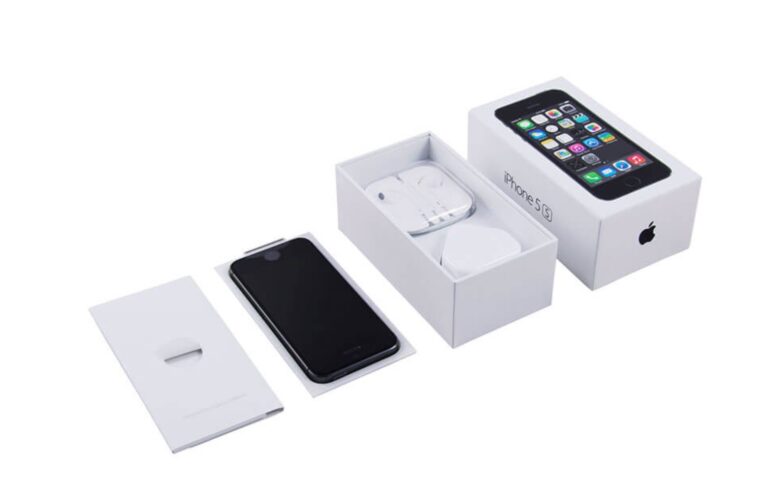
Why create a beautiful package design if it’s hard to open or cumbersome to hold. Design agencies like us carefully think all these details through to give the consumer the best user experience. All you need to do is walk into your local Apple Store to see their gorgeous and super user-friendly packaging. So many people keep the packaging because it’s so lovely. Some people go so far as to feel guilty about throwing away the packaging. I know we do when we get our new iMacs or iPhones for the office. Perhaps you won’t have the type of budget Apple has for their pack design, but you can get close with creative thinking by our superstar designers. You can read Apple’s packaging strategy in this pdf here.

The power of Apple’s intelligent brand packaging

3) Simple Messaging

The message is simple; keep your packaging information to the point and clear. Don’t make it too wordy or cluttered. Consumers want to know what the product is, its ingredients and if it’s safe to use. The latest packaging trends on Pinterest shows that minimal graphics has become the newest fashion. Wander down any Coles aisle, and you will see how quickly the uptake in minimal design trends has becomes. You’ll be surprised how minimal packaging designs stands out over cluttered designs with information overload.

4) Copywriting

The words on your packaging can have a tremendous impact on whether the shopper picks it up or not. Messaging is the critical emotional connection you’re looking to create between your product and their behaviour. A few simple words could mean the difference between the sale or not. As a full-service packaging design agency, we use our copywriters to develop catchy sales triggers to capture the buyer immediately. 

The copy will have a huge impact on how consumers behave. What they read will have a massive impact on their buying decision.

5) Honesty

A no-brainer, but don’t oversell or make promises of what’s inside the packaging that is simply untrue. It’s far too easy for consumers to leave negative online reviews of products that didn’t cut the mustard or live up to the consumer’s expectations of what was detailed on the box or carton. Too much hype and little substance is a sure-fire way to lose customer loyalty and get a swathe of bad publicity.Note that there are rules and regulation regarding what you can say on the packaging, but we will tell you these at our first briefing. Take a quick look at the Food Labelling Laws in NSW.

Your product’s packaging has to just through a few hurdles before it can be sold in NSW

6) Be Authentic

Make sure you stay true to your messaging, product and brand story. Don’t try to mimic or copy another brand which is why the team at Hopping Mad Designs can create a completely bespoke brand and tailor-made for your business.Authenticity in all facets of the packaging design process creates big brands that consumers love and are super-loyal! Think Lululemon, Rip Curl, Addidas, Apple, Lego and more. The list goes on, but all of these brands have one common thread; they are 100% authentic in design and key messaging.

7) Shelf Impact

Marketing Mag tells us that; Our research and development (R&D) have identified that packaging is one of the top three drivers of purchase, so it pays to ensure your pack has a strong impact and presence on the shelf.People browsing aisles at Coles, Iga, ALDI or Woolies don’t see an individual product. They see a whole bunch of colours, messages and call to actions. The only way you will cut through to the shopper is on fundamental scientific principles such as the ones we discuss here. Get it right, and you’ll be selling more products than the competition.

8) Futureproof your product

You can’t think that you will have one product, and that’s it. Just imagine you have a range of products in the future based on the success of your launch. Or perhaps you are launching a family of products that require consistent messaging. You need to get it right from the get-go if you’ve got any chance of success on the supermarket shelf. Colours, branding, messages, copy all need to reflect the style and range of the products. So that as your range grows, all you need to do are a few simple tweaks and presto, you have a new product SKU.

9) Common sense

Get the message and design is one thing, but what about all the other practical issues involved with getting the product into the consumer’s hand. Your designers need to know about other packaging contingencies such as:

  • How does the product stack or hang on the shelf?
  • Is it easy to transport?
  • What’s the weight of the pack, and how will that affect supply and delivery costs?
  • Does the product need to be in a freezer, and how does this affect the ink on the box?
  • Is it easy to handle and transport?
  • If it’s a fragile product, will the packaging protect it?
  • Or, will it fit neatly into the SUV or car?
  • Can the product be refined later on if need be? Remember the tomato sauce bottle with the screw cap and how that’s evolved over the years. A job for industrial designers, but the packaging has to grow with this.

Designers need to address all these nuances on top of the packing design. It’s not as simple as it would seem!

10) Unique Selling Point

How ell does the packaging communicate the products USP or unique selling point? The USP is where everything comes together nicely; the critical message, branding and the graphics. The effort you put in conveying the USP will have a ripple effect on sales. The ROI will be huge. 

Conclusion

As a trusted packaging design agency in Sydney, Hopping Mad Designs considers all these crucial elements in our packaging design process. Our senior creative, Joanna Basile, has had years of experience in the packaging design space and will give your product the professional edge needed to stand out and sell.

About the author

Joanna Basile
Jo is the founder of  Hopping Mad Designs, a brand agency with 22 years of experience working with brands to position them for growth. Jo has extensive experience working with corporate, retail, food, pharmaceuticals & beverage clients.

The Psychology of Color in Marketing & Design

Colour psychology is a study of how colour affects perceptions and behaviours. It is a very complex theory that has not yet been analysed enough. Because of the lack of information and knowledge, it’s difficult to use in the right way in marketing and branding. In marketing, we use colour psychology to focus on how the colours impact consumers’ impressions of the brand and to persuade consumers to make a purchase and consider the brand. It’s a very important field to consider when creating marketing strategies and assets, such as building a new business or rebranding one.
It’s difficult to connect colours with certain feelings and emotions that arise when seeing one because it is too dependent on personal experience. To choose a colour for your brand is not an easy task, because you have to take the feeling, mood, and image of your brand into consideration. In other words, question yourself does the colour fit for what you are selling. Below, you will see how colour can be properly applied in marketing and branding.

The Colour Blue

inline_586_https://hoppingmad.com.au/wp-content/uploads/2020/02/The-Psychology-of-Color-in-Marketing-Design-1.jpg

The colour blue is known for its trust and dependability. It is a colour that is reliable, responsible and mentally soothing. It’s considered as one of the most-liked colours in the world. We can see blue everywhere in the marketing space because it can evoke a wide span of emotions in consumers. It’s a colour used by many favourites and popular brands like Facebook, Twitter, and companies like Samsung, IBM, Visa etc. Blue is in the cool spectre of colours, so it evokes emotions of professionalism, authority and trust. That’s why political parties use the colour blue.

Choosing a shade also matters. Each shade conveys different emotions, so it’s essential to give it a lot of thought. Colours also play a key role in directing users’ attention. If you are using blue on your website strategically it will tell visitors how to feel about certain information and your brand. Having a bright shade of blue on a light background such as a call to action will make it stand out. Using a blue shade as a call to action colour will ask for trust from the consumers, making them more open to using your product. Consider that if using blue in equal amount with a contrasting colour like orange, can create a lot of visual noise, making your viewers overwhelmed.

The Colour Purple

inline_703_https://hoppingmad.com.au/wp-content/uploads/2020/02/The-Psychology-of-Color-in-Marketing-Design-2.jpg

Purple is a very strong colour, and very often it divides people, who either love it or hate it. There are numerous ways to use purple in marketing, depending on which emotion you want to portray. Purple is also often associated with women and femininity. It’s known that women generally like purple more than men do. This colour has been used with some very powerful women’s causes like the Women’s Liberation movement. International Women’s Day also used a rich purple for its logo. Purple is historically associated with achieving gender equality.

Purple rarely appears in nature, making it a primarily artificially made dye. In Roman times, it was worth more than its weight in gold and was only worn by Roman emperors. Because the supply was limited, it was associated with extreme wealth, making kings and queens adopt it as a noble colour. It is also connected with something out of this world, symbolising peace and wisdom in Hinduism for example. Creativity and imagination are tied to purple because it is not found in nature as much. Using purple in your marketing will convey a message of mystery, luxury and creativity.

The Colour Red

inline_319_https://hoppingmad.com.au/wp-content/uploads/2020/02/The-Psychology-of-Color-in-Marketing-Design-3.jpg

Red is considered the most emotionally intense colour, symbolising importance, intensity and excitement. It draws attention and draws the eye’s focus making things more noticeable. It is also a colour that creates a sense of urgency, which comes in handy when making sales. Depending on your brand and what you are selling, consider carefully whether you should use red in your designs or marketing. It’s a passionate colour, which is why it’s used on cars and lingerie. Using it a little bit is an effective way to make important words and information stand out, but when used too much, it becomes overwhelming.

The famous brand Coca-Cola uses red for its logo, advertising and packaging. We’re all familiar with popular drinks and the colour we associate with them. A lot of fashion brands use it, like H&M and Levi’s, Target and design software company Adobe. It’s a colour that encourages appetite, so it’s used in fast-food companies like KFC and Chick-fil-A, and manufacturers like Heinz, Red Bull etc.

The Colour Orange

inline_47_https://hoppingmad.com.au/wp-content/uploads/2020/02/The-Psychology-of-Color-in-Marketing-Design-4.jpg

Orange represents fun, energy and ambition. It’s connected to the sun like yellow, giving it a feeling of warmth and radiance. It’s a great colour for a non-corporate brand. When using a darker shade of orange, it’s connected to autumn and earthy feel. If your company is energetic or you sell those types of products, orange is the colour for you. It’s a very playful colour so it’s used frequently in brands for children, like the TV channel Nickelodeon. It’s used by Amazon, the biggest shopping website. Since it represents energy, Harley-Davidson motors use it as the colour for their logo.

It combines colour red’s energy with the friendliness of yellow. It is a great colour for bringing comfort and a sense of fun. It is also a perfect accent colour, especially when used with the contrasting colour blue as a background, as it makes it pop out. If you need a call to actiob on your primarily blue website, orange is the perfect solution. A well-accentuated use of orange on a properly designed website can attract consumers towards what you’re aiming for. Use it wisely, because a lot of orange colour can overwhelm the consumers.

The Colour Yellow

inline_783_https://hoppingmad.com.au/wp-content/uploads/2020/02/The-Psychology-of-Color-in-Marketing-Design-5.jpg

Yellow signifies warmth, optimism, and cheerfulness. It is a symbol of happiness and laughter. It is a colour that is rarely used alone. When used too much it can be overpowering and feel too bright to the eye, so try to use it to highlight certain things that need to stand out. It’s most commonly used in the food industry, like McDonald’s and Burger King, and the auto industry like Ferrari and Chevrolet. Many powerful companies use yellow in their logo and branding, like construction company CAT, delivery service DHL and camera company Nikon. If you want to increase confidence, provide inspiration or lift someone’s spirit, use yellow in your design and marketing. It’s also a colour used in shops’ windows, for sales and new collections, attracting buyers.

The Colour Green

inline_868_https://hoppingmad.com.au/wp-content/uploads/2020/02/The-Psychology-of-Color-in-Marketing-Design-6.jpg

Green is a colour of balance, harmony, and nature. It has a balance of logical and emotional, giving us a sense of the right choices. It is the most common nature colour, representing life, rest and peace. It is a sign of growth, with nature like plants or our income and wealth. It is a very easy colour on the eyes. If your business has nature and sustainability focus, green is the perfect colour for your branding and marketing.

It’s a colour used for recycling symbols and other symbols that represent nature and taking care of it. The colour represents life, so companies that promote health and nature, like the TV channel Animal Planet, use it. Since it is connected to wealth and money, it can be used if you are trying to sell certain products or show ways to increase the wealth of your consumers. It can have negative aspects like over-possession and materialism, so use it in moderation.

The Colour Black

inline_193_https://hoppingmad.com.au/wp-content/uploads/2020/02/The-Psychology-of-Color-in-Marketing-Design-7.jpg

Black is not on the colour wheel, as it is viewed as an absence of light. But we see it and use it very often. It is a very powerful colour. Black is considered a neutral colour, often used to stabilise or subdue vibrant colours. It is associated with elegance, formality, modern and luxurious. If you sell high-end, luxury items, black is the colour to use in your branding, especially websites. When used with white it creates a contrast, making users focus on product photos and vibrant accents. Too much black can seem grim and uninviting. It has a very functional design aesthetic, making it a very easy colour to incorporate in design and marketing in business.

It’s a colour used in printing publications, giving it a serious note that you can translate to the online world. It’s used in very successful brands and marketing like Apple, Gillette and Chanel. It is a colour used boldly and to make an impact while remaining modern or traditional, depending on the typography used. Using black in already dark colours in counterproductive. It strains the eye and reduces readability.

Conclusion

Whichever colour you choose, be careful and take into consideration how it affects the users that see it and your brand. Will it give you a fun and inviting feeling or give an edge? Or will it be calming when used with blue or green? Take into consideration what your brand is about and what message you want to send to the consumers and then you will see what colour is perfect for you. Use complementary colours to enhance important buttons and information, but use it sparingly to avoid making the user overwhelmed.

Tips for choosing a creative graphic design agency

If your looking for a creative graphic design agency for your next marketing project then finding the right agency online is not as easy as it looks.

Essentially, the choices are limitless and you can find anything from freelancers advertising on sites like Fiveer, Gumtree, even Air Tasker, right through to high-end agencies that will never deal with small businesses.

So how on earth are you going to find a graphic design agency that is the perfect fit for your business, company or organisation? It’s not easy, so the following are some really handy tips to get you started in the right direction on your quest to find a top graphic design team.

Never go with a graphic design agency purely based on price

Yes it’s a competitive market place and yes as a business you want to source the best deal for your design project but it can be risky going for the cheapest graphic designer. In 2021 going on to 2022 there are so many options online when it comes to finding a designer and this creates a market where designers are basically cutting their design fees in order to get the job. The issue here is who are you getting, what experience do they have and even more important are they actually doing the job or are they outsourcing the graphics to someone else.

When you go online and find graphic designers online you don’t really know who you’re dealing with. Sure they may have a flashy design portfolio but can you be 100% certain that it’s really theirs? You have to be so careful when trusting any old person with your marketing. Plus, if they come in too cheap then the chances are they’ll only spend a small amount of time on your project. This could work out against you if you decide you don’t like the designs presented and want to make some changes.

This happens all the time because graphic design is so subjective. Changes are part and parcel of the design process so cheap quotes may not include these. The moral of this point is to go with a graphic design studio that is not too cheap nor overly expensive. Middle of the road is your best option.

Also read: How Graphic Design Is Evolving

Make sure they have a physical studio or agency

Many design projects whether they be brochure design, logo design or even some packaging design needs a face to face meeting in order for you to get the right design brief. Your graphic designer must have a clear understanding of what you’re looking for and what you’re trying to communicate. Doing this via email is not so easy and your idea of what you’re looking for in a design outcome can be vastly different to theirs.

This is where projects go pear-shaped, and they can easily derail when the design brief is not met. This is why you have to meet with a local graphic designer. Preferably one that’s Sydney based.

You need a multi-talented agency

In today’s world design is not limited to print only, therefore your graphic design team should have the ability to take what they have produced and be able to put it on your website and perhaps your social media. Therefore it’s best to go with a graphic agency that has a digital arm as well. This way everything is done under one roof without the need to source different suppliers. It saves you loads of hassle and ultimately you end up spending far less.

Work with a senior team of creatives

Are you working with juniors, someone straight out of uni or cafe or are you working with senior creative designers? If you a small start-up with a seriously small budget then going and sourcing your design work from a uni graduate or going online to community-based platforms might be your best option. But, if your looking for a creative edge and are wanting your product or business to outshine your competition then you need a graphic design agency that has been around for at least a few years.

They should have a strong design portfolio, backed up by a variety of work.

There are a lot of niche graphic studios out there that specialise in none particular area of work such as medical, legal or travel. You do not want to align yourselves with these agencies as their design style is very particular. Try to find a studio that has handled many types and varieties of business.

Look at online reviews

Always check their online Google reviews to see what other people have said about their work. Obviously, there may ( and you’ll have to expect this) be some negative reviews but don’t focus solely on these. Look at the positive ones, and cross-reference this in their graphic design portfolio.

Go with an agency you like

Meet with them and see if you like the people you will be working with. Sometimes, graphic design projects can take weeks if not months and ultimately this is a close relationship so you have to get along with the people. If you get a funny feeling about them when you meet for the first time or you don’t feel the fit or work culture they have is in line with yours then look elsewhere as it won’t work out.

Make sure they are able to handle your printing if necessary

Graphic design is only one part of the process. You then need to get brochures or your reports printed and this should be done by a printer that the design agency can manage. If it’s a complex print job then you definitely have to rely on the designers for the best outcomes. Again, only a team of professional designers can handle this.

These are just a few tips to help those business owners find a decent graphic design agency that won’t cost the earth and do a great job. If you need any further help please contact us here at Hopping Mad Designs.

We have been in the graphics industry for over 22 years, so you’ll be dealing with experts.

5 Reasons why you need to update your logo

1. Your Company has changed and evolved.

Businesses are becoming more and more flexible in the way they do business and offer services. Nowadays you have companies that deal with all aspects of an industry under one roof as well as companies that are niche and specialize in particular aspects or products. Either way, it’s important to have a logo that reflects who you are and what you do. For most businesses, it makes sense to evaluate your visual identity and make sure that your business is reflected in the most advantageous way. Changing your logo signifies your willingness to embrace your new direction and a newfound enthusiasm for your business. If your brand is unwilling to adjust to changing circumstances, then it’s going to fall behind. The new consumers, millennial’s and Gen Y, are found to be increasingly unpredictable when it comes to brand loyalty and will start to look at competitors if your brand image is not meeting or exceeding the standards of the market.

Related post: Tips for choosing a creative graphic design agency

2. Your graphics are outdated.

If your brand has been around for more than a decade, the chances are, your logo is starting to look a bit outdated. Your current logo might not be optimized or flexible enough to work well on a website, social media, or digital advertising. It might have looked great on a sign or in a newspaper ad, but now it’s important that your logo works well across all mediums. This could be as easy as creating a simplified version of your current logo or as challenging as creating an entirely new one. Google recently updated their logo, still using the same colours but the traditional serif typeface has changed to a bold sans-serif. On their official blog, they explain that the reason for the logo change is to reflect the way people use google across multiple platforms. The original logo and branding were built for a single desktop browser page and have now been updated for “a world of seamless computer across and endless number of devices and different kinds of inputs (such as a tap, type and talk)”  In recent years, large online brands such as Yahoo and Facebook have also chosen bold sans-serif fonts for mobile optimization and device compatibility.

3. Impressions and higher perceived value.

Logos make the first impression on clients and potential clients. Before you send an email, someone calls you or your car pull us, customers consider your logo and visual identity and decide if you are someone they can trust.

You need to be sure that your logo conveys a sense of trustworthiness and confidence. As much as we are told not to judge a book by its cover, we still do. A logo that speaks quality will give potentials a higher perceived value of your brand, this means that when you have a great, well-designed logo you can easily justify your prices and maintain your profit margin.

4. For better recognition and growth.

If your logo is not recognizable in your industry then how will you differentiate yourself from the competition and how will new customers and clients remember you? A new logo can help you stand out and be memorable and increase the likelihood of repeat business and recommendations. Forbes tells us that Brand perception is never set in stone. With every new generation of consumers and changes in the markets, a customer’s view of a well-reputed brand has the potential to change – for better or for worse.

5. Revitalising your company.

If you’ve had some bad press or things have taken a few wrong turns, it could be a good idea to rebrand. A fresh look can help change customers’ perceptions and help transform your brand in a positive way. It can help you reposition yourself in the market and can be used as a way of handling increased price competitiveness.

Things to keep in mind when redesigning your logo.

There are a few things to keep in mind when redesigning your logo, the first and most important is to keep it simple. A simple, yet effective, logo should be easily recognizable, versatile, and memorable. It should also be effective across all mediums from print to signage to digital. Your logo should also have some sort of meaning behind it, something that embodies the company’s values or goals. One of the best things you can do when redesigning your logo is to try and make sure it’s timeless. Think about how it will look in 10 years’ time, this will save you time and money in the future.

20 logos that inspire us as a graphic design agency

What makes an inspiring, consumer-focused and attention-grabbing logo?

A truly classic logo is powerful, recognisable and stands the test of time. A logo helps create an image for your company and should reflect what your company is about; its personality, core values and ethos.

In a world where companies are fighting for the consumer dollar, it’s essential that your businesses logo presents something unique.

As a graphic design agency, logos that inspire us are the ones that are iconic and engage the audience immediately. The logo is the first that customers see when they interact with your brand, so it’s no coincidence that some of the biggest and best brands in the world have the best and most aspiration logo designs.

There is no easy answer as to what kind of logo is the best or most effective, but it would be fair to say that the most creative designs catch our eye and inspire us to create.

Logos can consist of symbols and icons, but the text is also important and you can be just as creative with it. Most logos communicate an idea, an idea of what your company is about. Logos can be simple yet create a bold statement or can be a playful pun on your business name. Whatever it may be, logos that inspire us as designers represent the company in the best possible means and leave us with a long-lasting impression of that company.

Below are the logos that inspire us and really push us to create great identities, brands and logos for our clients.


  1. Nike (Swoosh Mark)

The swoosh is a corporate trademark, originally designed by Carolyn Davidson while she was studying graphic design at Portland State University.

inline_699_https://hoppingmad.com.au/wp-content/uploads/2015/09/blog_0004_Nike_Swoosh_Logo_Black_original-1.jpg


  1. Boundary

The boundary is a performance monitoring solution for data networks, the continuous line between the letters is both visually appealing and conceptual.

inline_477_https://hoppingmad.com.au/wp-content/uploads/2015/09/blog_0010_Boundary.jpg

  1. BarCode

A fun play on the name of the brand, the logo is recognisable and you get an idea of what the brand is even without the wording below.

inline_669_https://hoppingmad.com.au/wp-content/uploads/2015/09/blog_0011_bar-code-logo-design.jpg

  1. Air BNB

Created around the concept “Belong Anyway” the logo encompasses a heart with a map pin icon.

inline_875_https://hoppingmad.com.au/wp-content/uploads/2015/09/blog_0013_airbnb.jpg

  1. Mastercard

Simple design, that is easily recognisable. The interlocking circles show strength and the dynamic colours are recognizable.

inline_319_https://hoppingmad.com.au/wp-content/uploads/2015/09/MASTERCARD.jpg


  1. Penguin Books

The logo works for its simplicity and repetitive use over time. The penguin is distinct, and easily recognisable and has become synonymous with books.

inline_886_https://hoppingmad.com.au/wp-content/uploads/2015/09/blog_0002_penguin-logo.jpg

  1. Adidas

The iconic trefoil is mean to represent the continents America, Europe and Africa and the three intersecting lines representing diversity. The three lines have become key in branding, and although simple, they’re easily distinguished.

inline_348_https://hoppingmad.com.au/wp-content/uploads/2015/09/blog_0014_adidas-logo.jpg

  1. Chevron

Using the V shape to reference military history, the brand has embedded itself in American culture.

inline_356_https://hoppingmad.com.au/wp-content/uploads/2015/09/blog_0009_Chevron-logo.jpg

  1. BP

Created with a strategic rebrand in mind, the sunflower represents the energy of the sun and the use of the colour green shows the brands environmental consciousness. The simple shapes are what works best for this brand.

inline_131_https://hoppingmad.com.au/wp-content/uploads/2015/09/blog_0017_BP.jpg

  1. MTV

The distinctive M was originally a sketch, with the ‘tv’ being spray painted. The relaxed, rough nature of the logo makes it accessible and relatable.

inline_800_https://hoppingmad.com.au/wp-content/uploads/2015/09/blog_0015_2000px-MTV_Logo_2010.svg_.jpg

  1. Puma

The Puma logo is a sign of courage and athleticism, encompassing the nature of competition.

inline_164_https://hoppingmad.com.au/wp-content/uploads/2015/09/blog_0001_Puma_Logo.jpg

  1. Fedex

The bold colours, clear type and clever use of negative space to create the arrow make this logo work.

inline_739_https://hoppingmad.com.au/wp-content/uploads/2015/09/blog_0007_fed-ex.jpg

  1. Circus of Magazines

Visually stimulating, clever use of negative space while avoiding clichés.

inline_119_https://hoppingmad.com.au/wp-content/uploads/2015/09/blog_0008_circus20of20magazines.jpg

  1. uBear

Another interesting use of negative space, while maintaining a strong graphic the doesn’t immediately make you think of a teddy bear or something childish.

inline_375_https://hoppingmad.com.au/wp-content/uploads/2015/09/blog_0000_UBear.jpg

  1. Oz Harvest

Oz harvest logo is interesting in the sense that it doesn’t follow a conventional logo form, is increasingly busy and breaks most design rules, but it works, its memorable and definitely shows you what their brand is about.

inline_393_https://hoppingmad.com.au/wp-content/uploads/2015/09/blog_0003_ozharvest_logo_detail1.jpg

  1. Curvature

Interesting play on the name, will make a simple logo stand out. Although the wording isn’t completely legible, your mind fills in the gaps.

inline_950_https://hoppingmad.com.au/wp-content/uploads/2015/09/Curvature-logo.jpg

  1. Made in Britain

The logo immediately makes you think of the Union Jack – the most recognisable British symbol. When you look at this logo the brand is aligning itself with that of Union Jack. A play on something so recognisable works this brand and the simplicity has ensured its longevity.

inline_990_https://hoppingmad.com.au/wp-content/uploads/2015/09/blog_0005_MadeInBritain.jpg

  1. American Table

A simple reflection of the brand and a well thought out way to combine the A and the T.

inline_382_https://hoppingmad.com.au/wp-content/uploads/2015/09/blog_0012_american-table-logo.jpg

  1. Six 3 Nine

A clever combination of shapes and use of clear space. The combination of text and number makes this particularly interesting.

inline_18_https://hoppingmad.com.au/wp-content/uploads/2015/09/blog_0016_639-01.jpg

  1. Killed Productions

A clever play on the company name leaves it up to the customer to decide which other letter has left the I for dead.

inline_177_https://hoppingmad.com.au/wp-content/uploads/2015/09/blog_0006_killed_lg.jpg

I am updating this blog on 10 May 2021 by adding 3 more logos that are current today and stand out as great logo and graphic design example.

1)Australia new Trade logo


inline_26_https://hoppingmad.com.au/wp-content/uploads/2015/09/logo-designs-for-2020.jpg

According to CNN this now looks like a virus and in the world of COVID is this really a great design? Let’s leave it up to you to decide.

2) NRMA Parks & Resorts

inline_81_https://hoppingmad.com.au/wp-content/uploads/2015/09/best-logos-for-2021.jpg

NRMA Parks & Resorts logo is clean, simple yet easy to recognise for people wanting to travel around Australia.

3) Australian Art Supplies

inline_420_https://hoppingmad.com.au/wp-content/uploads/2015/09/best-australian-logos-2021.jpg


Why Graphic Design Is Still Vital For Business Success

Does your current advertising campaign include aesthetics with the power to grab – and keep – the attention of would-be clients?

Regardless of what you may have heard, graphic design is still vital for the success of any business and there are many reasons for this. Incorporating professional graphic design into your advertising campaign will:

Increase the visibility of your brand – A professionally designed logo instantly increases the visibility of your brand by allowing consumers to put a ‘face’ with the name. To achieve this, your logo should be memorable and unique, while accurately representing what your brand at the same time.

Establish brand loyalty – The most common reason consumers become loyal to certain brands is because they remember the experience they had with their product or service. The easier your brand is to recognize, the more likely clients are to become repeat customers and recommend it to someone else.

Give your brand a competitive edge – Humans are visual creatures and, by definition, are drawn to beautiful imagery that tells a story, conveys a message or evokes certain emotions. Piquing the interest of would-be clients focuses their attention on you, instead of ‘the other guy’ and provides your brand with a competitive edge.

Create a lasting impression on would-be clients – When consumers are looking for a product or service, most do a quick online search to find companies that can offer a solution. That means a company’s website is responsible for making that all-important first impression on would-be clients. A professionally designed website is usually indicative of a professionally managed company, which is very attractive to would-be clients.

Establish continuity across a variety of platforms – Savvy business owners will expand their advertising campaigns to include a variety of outlets that include the printed form, such as signs, business cards, stationery and a host of other printed mediums. Graphic design elements are just as important offline as they are online. Professionally done graphic design helps facilitate continuity across all these mediums, ensuring that your color schemes, layout, logo placement and other crucial elements look their best, regardless of their form of presentation.

Enhance searchability – Graphic design isn’t just about images, fonts and layouts. A great graphic design campaign also enhances a website’s searchability, which improves search engine rankings, generates more traffic and increases conversion rates.

Ensure compatibility across multiple browsers and devices – If your website looks great in one browser, but horrible in another – think of all the business you’re losing out on because would-be clients who prefer one platform over another are unable to access your site. This is a costly, but common mistake that many businesses make – and one that you brand can easily avoid with professional graphic design.

Increase sales & website conversion rates – The goals of any advertising campaign are pretty much the same – increase sales, attract new clients and grow your business. Effective graphic design with a multifaceted approach ensures any brand will be successful in reaching those goals.