How to Increase the Sales Conversion Rate of My Website?

Getting a decent amount of traffic to your website is the name of the game. 

You have to get as many qualified customers to your website as possible to have any chance of making sales.

To get your website ranking on Google for your main core keywords is the end game. But wait, there’s more. Great website rankings are only 50% of the challenge; the other 50% happens when they land on your website. Do they arrive on your page and make an inquiry or leave your website without making a sale or inquiry

If you find that you are ranking well, but the phones are not ringing, something is wrong, and you need to take action ASAP. After all, you’ve put all the hard work and effort into getting decent Google rankings; now, you need to convert these site visitors into paying customers. 

Known as conversion rate optimisation, you must keep people excited and engaged once they land on your website. Moz describes conversion rate optimisation (CRO) as the systematic process of increasing the percentage of website visitors who take the desired action — filling out a form, becoming customers, or otherwise.

As a business owner, you always have to be looking for ways to improve your CRO rates. If you start to let them slide, you’ll soon see what happens. It’s a disaster. People will not engage with the site and start shopping or buying from your competition.

In this blog, I will highlight a few simple ways to help you improve your websites conversion rates and get more sales leads, inquiries and revenue.

What Is a Good Conversion Rate?

Many people ask this question, and it’s not as cut and dry as you’d think. Conversion rates vary between industries and competitive keywords, so we can not give specifics on this. Crazy Egg tells us that your conversion rate represents the percentage of website visitors who take action on an offer you present to them. It’s a way to track the effectiveness of your messaging and the product behind the message.

Obviously, if you’re an eCommerce business, you want to get conversion rates as high as possible. CRO Experts tell us that having a conversion rate of between 5-10% is a decent figure. Anything higher and then you’re getting into some serious conversions. You can add PPC or Adwords into the mix here, and you would like to have the maximum CRO rates as each click on Google ends up costing you money.

Conversion Rate Optimisation Tips

A quick search for “conversion rate optimisation tips“, and you will find plenty of information online. But before you go ahead and rush into making any changes to your website to improve CRO rates, you first have to know your web goals and understand your audience. Once you know what you want to achieve and what your audience wants, you can then go about the necessary web changes to improve conversion rates.

The best strategy for a business that sells directly to another company could mean a lifelong client worth many thousands of dollars or an eCommerce store where the average sale is $15 to follow these conversion boosting tips.

Write Killer Headlines

Headlines attract the eye and are the most crucial part of your landing pages—the more attention-grabbing the headline, the more chances of consumer engagement and interaction with the site. If they like the headline, then they will read further. If what they initially read is garbage, expect them to exit the page.

David Ogilvy explains that many people read the headline five times as read the body copy on average. When you have written your headline, you have spent eighty cents out of your dollar.

If you think about that statistic, you’ll come to appreciate how strong your headline is for each page of your website. If you get stuck writing headlines or don’t have the experience, I suggest getting an SEO copywriter to help you with this.

How can you write killer headlines?

  • You have to understand your audience and write headlines that will immediately appeal to them.
  • What’s your unique selling point? Do you know it? Well, you should, and it must be included in your headline. Ulrika from Sparrow Loans has done this on the website’s home page by highlighting that their loans help businesses within 48 hours. It’s those types of headlines that catch the readers eye very quickly.
  • Use words in an offer that solve a person inquiry, such as; ‘Do you want?” ‘Learn How To’ or’ Did You Know?’
  • Test and retest again. There’s no harm in doing this and seeing what works and what doesn’t. For example, I will change the headline 4 or 5 times before I’m satisfied with it and check bounce rates in my Analytics account frequently to see if the heading change has had any impact.

Reduce Complicated Forms

Just imagine you want to sign up for a cooking class, but you had to fill in a 3-page form before you could. Or, perhaps you want to buy a new iPhone online, but you needed to sign up to create an account without having a guest option? 

Extensive sign-up forms are a massive roadblock to the check out process and are a massive contributor to reducing conversion rates. Consumers and your customers want to get into your site, make the inquiry or buy the product as quickly as possible. Forms complicate the process and make it a hassle. If you want to improve website conversion rates, get rid of clunky, lengthy forms.

Remember, people don’t want to give you all their personal information; they want to buy without handing over all their details. Search Engine Journal puts it nicely when they tell us Don’t ask someone for their credit card number, social security, grandmother’s pension, and children’s names right off the bat – your user doesn’t trust you yet.

Hopping Mad Designs Tip: if you have to have forms keep it to a maximum of 3 to 4 fields only.

Add Live Chat

Adding a live chat feature is now super-common and at the bottom of most websites. If you were not sure about a product or service and are still sitting on the fence, then the ability to talk to a customer service rep online immediately is a great way to sway them over. Plus, it adds a level of trust where you know that there is an actual person at the end of the chat feature responding to your questions.

Include Reviews

Did you know that 70% of people will leave a positive review when asked by the business, according to Search Engine Land? Always and I mean always, ask your customers to leave a Google Review when you can. Obviously, the experience needs to be positive, just like the guys at Bali Villa Escapes do. They rely heavily on TrustPilot for their reviews, and it works really well for them. Consumers like social proof and will respond favourably to your product or service if they can browse the reviews. 95% of shoppers read the reviews posted on business review sites such as Yelp, Google, Facebook, and TripAdvisor before making a purchase.

So, the take-away here is to get as many reviews as possible as this will increase your websites trust factor and inturn your conversion rates.

Place Call To Action Buttons Strategically

Your websites primary goal is to send clear messages to your customers. You must be able to guide them to certain hot buttons or a clear call to action throughout your website. Do you want them to call you? Then place a prominent phone number at the top of the page. If you want them to submit an inquiry form, create large submit inquiry form buttons on these pages. The trick here is to make it super simple for customers to contact you or sign up for your quarterly newsletter. Whatever your intention is, make it loud, clear and very simple to find.

WordStream highlights some common examples of call-to-action buttons are:

  • Add to cart buttons
  • Free trial sign-up buttons
  • Download buttons
  • Try Our Free Trial
  • Reserve Your Seat
  • Download Whitepaper

Perhaps create a sense of urgency as well with your CTA buttons such as:

  • Sign Up and Get 50% Off Today Only!
  • Download the E-Course for $10!

Even just adding “now” builds a subtly sense of urgency for users:

  • Register For The Ultimate PPC Webinar Now!

Do You Need Help Improving Your Websites Conversion Rate?

As we’ve mentioned above, there are loads of other conversion tips that would radically help improve your website’s conversion rates, but I’ve kept them to a minimum for the sake of this article. Conversion rates are not a set and forget proposition. You have to keep testing, refining and improving your website’s performance, and over time, you will see significant improvements in your customer conversions. 

Most businesses, unfortunately, do not fully understand or grasp the power of CRO and its benefits, but those that do will be seeing vast improvements in sales and inquiries – it’s as simple as that. 

If you need a web design team to help you boost your conversion rate, you should get in touch with Hopping Mad Designs.

Contact us now, and we’ll review your conversion rates and see what we can do to help you get more sales.
Website design in the dating agency space

Trying to compete in the dating agency digital space is hard and we mean really hard.

It’s super competitive and existing well-established dating agency websites have already cemented their brand and position on Google making it almost impossible for new entrants to dip their toes in the water and make a living in this space online.

Having said that, like other market niches online, where the chances of entering and succeeding some next to impossible, there is a way to edge in and be competitive if you have the right strategy and this is exactly what we managed t achieve for Melbourne dating agency website Blue Label Life.

I am bragging a bit here and this may sound like some sort of testimonial but if the truth is known we were asked to take over this website roughly 12 months ago from writing this blog ( July 2019 and revised on Dec ’21). And, from the moment we took it over we knew that we had a large mountain to climb and I will detail these in a bit more detail.

Rankings were suffering. They had been using two even three different web and SEO agencies to try and get the formula right but they never seemed to be quite able to get there. For their main keywords, they seemed to be hovering on page 3 or 4 and were relying far too heavily on the Adwords option. This was unsustainable and completely out of their budget comfort zone. Essentially, they were spending far too much on Adwords with little or no consumer engagement.

Let me elaborate on this further.

What I mean by this is that they were getting clicks through to the site but they were not converting these potential customers which leads me to the next point.

Low conversion rates: While the website was semi ok, it was not a high converting site. People came there but found it a tad confusing with far too many giveaways, ebooks and poor navigation pathways. Overall, it was far too cluttered with mixed messages.  And with all these add ons is diluted the trust value of the site. Customers felt that it was far too busy and this cheapened the overall experience.

This was a throwback to their earlier designers who felt that they could throw everything at the site and hope something sticks with the consumer. How wrong this was!

Also Read: Tips for choosing a creative graphic design agency

In today’s super-competitive online space, messages have to be clear and they have to be short and snappy with an approach that ‘less is more’. Which is exactly the opposite of what people thought Google was looking for about three to four years ago when jargon words like content was king was thrown around. While this may be true, you do walk a very fine line between overuse of irrelevant content and content that’s too thin for the page.

We feel that the days of lengthy pages with far too much content are over and this has been enforced with new Google algorithms. What Google is looking for are pages that excite & engage people to connect and browse. Search Engine Journal tells us in their article Content As A Google Ranking Factor: What You Need to Know – No doubt, content is an integral part of your digital marketing and SEO strategies. You cannot do SEO without something to put on the page.

The more engaging the site and the longer someone stays on your site the more likely it is they will make an inquiry. Google can measure this through what is termed ‘bounce rates’ and the less this bounce rate the better your eventual rankings. I won’t go into too much detail here about bounce rates but you can read more about what Google has to say about it here.

The problem with the Blue Label Life website was their bounce rates. They were pretty high and this was not only affecting conversions but it was affecting their rankings. Our job was to see to it that these rankings improved and bounce rates declined. You can easily check your website bounce rates via your Google Analytics account.

To address these flaws we had to fix some fundamental issues with the website such as:

– lack of clear inquiry pathways

– overuse of wordy copy

– title tags and page  descriptions were incorrect

– copy was over spammy

– there were no H1, H2, H3 tags on each page

– the graphics were outdated

– the site was not mobile friendly and this was a serious issue for the user experience as well as Google rankings.

– it was far too slow to load with large hi-res images

– no site map

– lack of clear branding

– old repetitive outdated blogs that were far too content thin. We have had to go through each blog article, make updates to make them more Google compliant.

– the list goes on but we’ll leave it there for now.

One major point was the online rankings.

The site had little branding except for their logo and there was nothing to differentiate them from their competition who had solid, well-recognised brand names. It was up to us to reposition them in the marketplace and establish their niche position. Basically, they couldn’t look like everyone else. Were they aiming at the luxury end of the market or were they appealing to everyone? As a luxury, high-end dating service this point had to be clearly communicated through a new design style and a complete overhaul of their brand and website.

Three years down the track the site is thriving and one of the most successful players in this space.

The moral here is that there is room for everyone online but you have to be prepared to let design experts have a go at it. Then and only then will you have any chance of being competitive.

You MUST Construct Landing Pages that Convert

Simply put if you intend to use Adwords, some type of social media or even an email marketing campaign to capture leads the page the customer lands on must convert.

Essentially, it needs to stand out and leave no doubt in the potential customer’s mind that they have come to the best possible website for their search.

This landing page needs to have some serious impact and hit the user right between the eyes with your message.

This is especially the case with Adwords where each cost per click can be really expensive. Basically, the money you spend getting the person to get to your page must be well worth it. Poor landing pages are a waste of money and time. Given the competition online and the cost per lead acquisition nowadays, your landing page MUST be better than the competition.

When I say conversion this could mean many things; from phoning your up, sending an email, downloading a form, signing up to a newsletter or webinar, basically, it’s what your intention or online goals are. Most businesses we deal with want their landing mages to either capture leads through and email or for the customer to call.
Following are what we feel are the most important points that go into designing a killer landing page that converts.

The user experience or UX must be very clear

A landing page is like no other page on your website. In fact, it should be considered a unique page; one that’s trying to communicate 1 simple message or sell 1 product. It must not be cluttered with too much information about everything you have to offer. The message has to be succinct and to the point. Once the potential lead lands on your page the message they read has to leave them with no unanswered questions.

Why? Because they have landed on your page from a Google search and your page must satisfy their query quickly without any fluff, waffle or over-designed pages. Keep it simple and to the point. Designing pages like this are best left to professional landing page designers that know how to combine attention-grabbing headlines and copy with great visuals for maximum impact – this is the key to landing page optimisation and making the most of the money you spend on your marketing budget. This is a very important component of your online digital strategy so make sure you get it right from the beginning.

Why not add a video on your landing page?

Nothing sells harder and has more online appeal than a well-produced 2-3 minute video. If your trying to promote a new product or service and want to really grab the time-poor visitors attention, nothing is better than a video. Remember it’s far easier to hit the play button for a person than it is to read 500 words. Plus if the video is professionally filmed, the end result will help improve the chances of the customer calling you.

Link this landing page to all your other marketing material.

If you have gone to the effort of designing a great looking landing page then the best thing you can do is spread the word out there and push it hard on all your marketing channels. Place the URL link on all your social media pages and if you are sending email newsletters out to clients add the link in this newsletter that will direct people to this new exciting page. All they need to do is press click and they will see your new wonderful landing page. The aim of this landing page is multi-purpose. It needs to fit comfortably on all your sales and marketing platforms so all the user has to do is hit the button and they arrive at where you want them to be.

Think about your Facebook ad campaign. Like with Google Adwords it must have the same impact and you need to produce the same type of result. That is, clear sales funnel that leads the buyer straight to where you want them to be.

The real beauty of landing pages is that they are totally separate from your website and can be used as a seriously powerful sales and marketing tool. Thinks about it. Imagine you had a service or product that you really wanted to push online without driving people to your larger main website where chances are they might get lost among all the other information. This is where landing pages step in and this is why they are really good at promoting a single point.

15 gorgeous landing pages that are conversion focused

Conversion is key and it comes down to design.

It’s all well and good to have thousands of unique visitors to your website each month, but how is that converting to sales and the success of your business. Does the site keep you hooked? Does it make it easy for you visitors to engage? Is the site sticky? Are there too many hurdles in the way of the buying process? Are you bounce rates way too high? The moment someone stumbles on to your page, they should know within a few seconds what your website is about and what they can get from it. Basically, it’s got to sell, sell, sell!

Effective conversion comes down to great web design and a well thought out user interface, so we’ve put together a list of our favourite sites that are designed to convert browsers to paying very happy customers.


Airbnb

Since their brand refresh, there has been and inherent focus on community, keeping the romance alive with customers and attracting repeat conversions.

The messaging is clear, as it answers how it works and asks you where you want to go.

inline_467_https://hoppingmad.com.au/wp-content/uploads/2015/09/shutterstock_193745936_0002_Screen-Shot-2015-09-02-at-1.41.09-PM.jpg

inline_715_https://hoppingmad.com.au/wp-content/uploads/2015/09/shutterstock_193745936_0001_Screen-Shot-2015-09-02-at-1.41.58-PM.jpg

inline_19_https://hoppingmad.com.au/wp-content/uploads/2015/09/shutterstock_193745936_0000_Screen-Shot-2015-09-02-at-1.41.42-PM.jpg

Bali Villa Escapes

This works in a similar way to airbnb, the imagery gives a sense of what its about, and the booking functions are the clear and simple. You want the user to be able to find a villa easily and quickly and this search box facilitates this. Large images combined with easy booking instructions makes this site a great user interface example.

inline_471_https://hoppingmad.com.au/wp-content/uploads/2015/09/blog_0006_Screen-Shot-2015-09-02-at-1.49.15-PM.jpg

inline_765_https://hoppingmad.com.au/wp-content/uploads/2015/09/blog_0005_Screen-Shot-2015-09-02-at-1.49.25-PM.jpg

Under Armour 

Boasting their star ambassador Stephen Curry, this site makes it easy to fill up your shopping cart.

inline_466_https://hoppingmad.com.au/wp-content/uploads/2015/09/blog_0008_Screen-Shot-2015-09-02-at-1.50.27-PM.jpg

inline_76_https://hoppingmad.com.au/wp-content/uploads/2015/09/blog_0007_Screen-Shot-2015-09-02-at-1.50.37-PM.jpg

Cienneny

Typography has become bigger and bolder in web design and by taking a minimal approach, Cienne cuts straight to the point.

inline_739_https://hoppingmad.com.au/wp-content/uploads/2015/09/blog_0010_Screen-Shot-2015-09-02-at-1.50.53-PM.jpg

inline_992_https://hoppingmad.com.au/wp-content/uploads/2015/09/blog_0009_Screen-Shot-2015-09-02-at-1.51.04-PM.jpg

 Take it App

Bright bold visuals and the magic word, “Free” draw your eye in and youre downloading from the app store before you even scroll down.

inline_342_https://hoppingmad.com.au/wp-content/uploads/2015/09/blog_0013_Screen-Shot-2015-09-02-at-1.51.15-PM.jpg

inline_506_https://hoppingmad.com.au/wp-content/uploads/2015/09/blog_0012_Screen-Shot-2015-09-02-at-1.51.23-PM.jpg

inline_748_https://hoppingmad.com.au/wp-content/uploads/2015/09/blog_0011_Screen-Shot-2015-09-02-at-1.51.30-PM.jpg

Get Harvest

Harvest creates eye catching contrast between the top navigation and draws your eye in to the “Try Harvest for free” button

inline_276_https://hoppingmad.com.au/wp-content/uploads/2015/09/blog_0015_Screen-Shot-2015-09-02-at-1.51.50-PM.jpg

inline_421_https://hoppingmad.com.au/wp-content/uploads/2015/09/blog_0014_Screen-Shot-2015-09-02-at-1.52.08-PM.jpg

Dropbox Guide

Clear and simple use of iconography and prompts to get started.

inline_401_https://hoppingmad.com.au/wp-content/uploads/2015/09/blog_0016_Screen-Shot-2015-09-02-at-1.52.28-PM.jpg

Spotify Taster Rewind

Strong typography and entertaining content, make it too easy to click back in time and share your discoveries.

inline_834_https://hoppingmad.com.au/wp-content/uploads/2015/09/blog_0018_Screen-Shot-2015-09-02-at-1.52.36-PM.jpg

inline_589_https://hoppingmad.com.au/wp-content/uploads/2015/09/blog_0017_Screen-Shot-2015-09-02-at-1.54.09-PM.jpg

Litmus

Similar to the Harvest website the contract between the main navigation draws you to get started now.

inline_921_https://hoppingmad.com.au/wp-content/uploads/2015/09/blog_0020_Screen-Shot-2015-09-02-at-1.54.43-PM.jpg

inline_3_https://hoppingmad.com.au/wp-content/uploads/2015/09/blog_0019_Screen-Shot-2015-09-02-at-1.54.55-PM.jpg

Genius

With bold colours and a strong call to action Genius makes it all to easy to browse the worlds biggest collection of song lyrics.

inline_297_https://hoppingmad.com.au/wp-content/uploads/2015/09/blog_0022_Screen-Shot-2015-09-02-at-1.55.01-PM.jpg

inline_84_https://hoppingmad.com.au/wp-content/uploads/2015/09/blog_0021_Screen-Shot-2015-09-02-at-1.55.12-PM.jpg

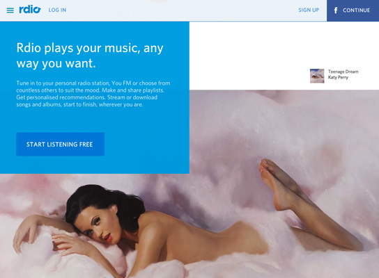
Rdio

With strong prompts to sign up and engaging icons, and long scroll makes Rdio an easy choice for your music needs.

inline_407_https://hoppingmad.com.au/wp-content/uploads/2015/09/blog_0024_Screen-Shot-2015-09-02-at-1.55.21-PM.jpg

inline_267_https://hoppingmad.com.au/wp-content/uploads/2015/09/blog_0023_Screen-Shot-2015-09-02-at-1.55.29-PM.jpg

Google Ideas

The use of strong contrast and engaging images captivates users and gives them a strong sense of what the site is about.

inline_894_https://hoppingmad.com.au/wp-content/uploads/2015/09/blog_0026_Screen-Shot-2015-09-02-at-1.55.37-PM.jpg

inline_758_https://hoppingmad.com.au/wp-content/uploads/2015/09/blog_0025_Screen-Shot-2015-09-02-at-1.55.48-PM.jpg

Uber

The site makes it clear how the service works, easy for you to sign up and explore other aspects of their business.

inline_961_https://hoppingmad.com.au/wp-content/uploads/2015/09/blog_0001_Shape-2.jpg

inline_803_https://hoppingmad.com.au/wp-content/uploads/2015/09/blog_0000_Screen-Shot-2015-09-02-at-2.03.11-PM.jpg

Dr Pico

Clever imagery and parallax scrolling, give the service an edge with simplicity, combined with clear call to action. Plus the site is extremely SEO friendly.

inline_882_https://hoppingmad.com.au/wp-content/uploads/2015/09/blog_0003_Screen-Shot-2015-09-02-at-2.03.42-PM.jpg

inline_816_https://hoppingmad.com.au/wp-content/uploads/2015/09/blog_0002_Shape-1.jpg

Polyvore

Displaying trending pieces, makes signing up and online shopping a breeze with perceptible sales and community growth.

inline_98_https://hoppingmad.com.au/wp-content/uploads/2015/09/blog_0004_Screen-Shot-2015-09-02-at-2.04.14-PM.jpg
The worst thing that can happen to your website is consumers abandoning your website once they find it. It’s like having an ugly shop front with rude staff. It’s just a no go zone. You can have your shop in the busiest retail strip with 1000’s of passing people each day BUT if they don’t like the look of the entrance or window display they will never come in. Same goes for your website.Page 1 on Google is great but if they are not buying from you then there are on site web issues that must be fixed immediately to fix these problems.

If you are looking to get a website designed that will be extremely focused on getting those people who land on your website to actually buy from you then speak with us. We will make sure that all your web pages are geared towards making that sale.


Why My Website Needs Conversion Rate Optimisation

The conversion rate is the percentage of how many visitors ‘convert’ – or answer a call to action.

A call to action is what a website owner wants visitors to do – like buy something, invest in their services, contact them for a consultation, sign up for their email list, etc.

A high conversion rate means a website is successful in attracting the attention of visitors and getting them to answer the call to action or ‘convert’. A low conversion rate indicate the opposite is happening and the webmaster should implement steps to rectify the situation. If you fail to do this, simply put, your website will fail. This is disastrous for your business, but there are ways to avoid this. It’s called CRO. Crazy Egg in the article The 13 Most Effective Ways to Increase your Conversion Rate tells us that ‘for every 100 visitors, you can expect to only get 2 customers. And honestly, that’s a pretty good conversion rate’.

CRO Works….it really does. Just imagine doubling your sales in a matter of weeks!

One of the best ways of increasing conversion rates is through Conversion Rate Optimisation (CRO). The CRO process is a systematic approach to making a website more appealing to visitors by enhancing user experience, streamlining the process of answering the call to action and making the most of the traffic the site already has. If your website is not performing, then it doesn’t have a CRO strategy.

Also ReadHow to Increase the Sales Conversion Rate of My Website?

CRO is a multifacted approach that encompasses proven tactics for improving conversion rates.

Some of the most common tool used in CRO are:

  • Site Analytics Monitoring
  • Visitor Feedback Monitoring
  • Usability Testing
  • Traffic Analyisis
  • Landing Page Optimisation
  • Ecommerce Conversion Testing
  • Heatmaps – check the best heatmap tools here
  • Multivariate Testing

When done right, CRO can be an invaluable tool to have in your online marketing arsenal.

Some of the most notable benefits of CRO are:

Makes use of your current traffic

You’re likely already paying for the traffic you have via paid advertising, PPC campaigns or other methods of SEO. CRO makes use of the traffic you already have so that your advertising budget doesn’t increase.

Creates a stronger, more loyal customer base

More often than not, if you make a client happy, they will be back. Providing them with an enhanced user experience via CRO is one way to ensure repeat customers and build brand loyalty. Just imagine adding on a website and hating what you find? You’ll never return. Improving CRO rates means that customers are more likely to stay and engage with the site. The more they are on your site browsing between pages, the lower your bounce rates and in turn better SEO rankings.

Increases ROI

By default, sales increase as your conversion rate does. CRO allows you to generate more revenue by utilizing the sales platform you already have in place, instead of investing in new methods of attracting business.

Gives you a competitive edge in your industry

Despite the many benefits of CRO and the large profit margins, it can create, the vast majority of websites either have no idea it exists or simply fail to follow through with its implementation. Doing so can give your brand the edge it needs to outsell the competition.

The page snapshot below is a great example of how conversion rate optimisation has helped a divorce lawyer in Sydney; Doolan Wagner not only helps improve their Google rankings but inquiry rates with some simple on-page tweaks and adjustments. View the webpage here. The content was thin and there were few call to action but all that was required was a few simple amends and they are now seeing the benefits of how vital CRO is for attracting and engaging new clients.

inline_674_https://hoppingmad.com.au/wp-content/uploads/2015/08/conversion-rate-optimisation-example-doolan-wagner.jpg
The Doolan Wagner services page ‘divorce layers Sydney’ required some minor tweaks to help with their conversion rates.

Every website can benefit from CRO, regardless of how well the business is doing. There is always room for improvement so don’t assume just because your sales aren’t slow right now that they couldn’t be better. On the other hand, if your conversion rate isn’t as high as you would like it to be or you’re just not seeing the results you hoped for when creating your website, CRO is definitely something to consider.

Using your websites landing pages to convert visitors to leads

You need landing pages that convert. Simple as that!

No good having anything less than this as it simply will not work, it’s just far too competitive online and in the digital space.

Basically it’s either 100% effort put into designing a landing page or don’t even bother. And, with landing pages you have to keep on trying. Measure it’s performance, see if it’s working and generating leads and finetune the landing page based on the data you receive either from the number of inquiries or Google analytics.

What is a landing page?

According to MailChimp, landing pages are different from other web pages in that they don’t live in the evergreen navigation of a website. They serve a specific purpose in a specific moment of an advertising campaign to a target audience.

Landing pages are single web pages (on your website) specifically purpose designed to sell one particular message. There will generally be more calls to action on these singular pages, such as ‘buy now buttons’ or ‘ for a fast quote click here button’ or ‘for a 50% discount inquire now button’. It’s focus is getting the consumer to take immediate action and engage with your business online.

The landing page idea is a great way to get new business, but the execution I’m afraid is a little bit more complicated. Having the idea is only half the battle, designing it for maximum conversion is the real challenge.

Following are some tried and tested techniques we use here at Hopping Mad Designs for our client’s landing pages so that they generate quality leads…..and more of them.

Also read: You MUST Construct Landing Pages that Convert

1) Make sure your offers are very clear…avoid ambiguous meanings.

Never send mixed messages on any of these landing pages. Make sure there is 1 clear to-the-point message. If you are going to the trouble and effort of doing this, then be clear and consistent with all your on page messages and calls to action. The use of strong images is also advisable as well as bold clear headings. These should be front and centre and the first thing that everyone sees. If you have strong headings a good idea is to follow these up with single like bullet points – you want it to be an easy read…then right after that have a big call to action. Wordstream goes so far as to tell us that only 16% of landing pages are free of navigation bars. Why is that bad? Because when landing pages are focused and have the navigation removed, companies can see a 100% improvement. One hundred percent!

2) Identify the benefits upfront

When thinking about the copy you want to write for your landing page, ask yourself this question: why has the consumer taken time to come to my website? What are they after? How can I help solve their search questions? The answer is to provide the benefits right up front. You need to clearly explain the benefits of your product or service rather than a description of the product. Think about what most car ads are about, lifestyle. They are selling you the image of prestige, adventure…what ever – very few will mention the actual fuel consumption or engine capacity. It’s all about the benefits and this is how all you landing pages should be structured.

3) Use really good, relevant images.

Let’s be very clear about this images that are relevant to your business and that have been professionally taken will have a greater click through and conversion rate than you standard photo library image. If your unique selling point is that you are the main asset of your business then have photos taken of you and perhaps your team. If you have a really good product that would photograph well, such as a luxury boat then make sure you promote this extensively on your landing page. If this is the main selling feature then push it hard and make sure it is above the fold (the top half of the web page).

If these photos are backed up by ‘big grab statements’ then this is the perfect landing page solution. A great conversion trick is to have an image and right next to it have an inquiry form that users can complete. Offer an incentive for them to complete this form such as a: free giveaway or a discount offering. You will be surprised by how many leads you can capture by simply implementing this type of strategy.

 4) Provide true customer testimonials

Do people visiting your website know your brand? Are they familiar with your service. Why are they going to trust you? Why should they buy from you when there are so many other choices and options. The answer is the testimonial. Get as many of them from real, existing clients and put them on your main landing pages. Honest feedback from past clients will reinforce your brand, massage, whatever…people will be more likely to buy from you if someone else has in the past and they were happy with this. Just a few short snippets on these page is enough to reassure your potential customers.

5) Keep on trying 

While these simple tips may point you in the right direction, the web you will find is a very dynamic and ever changing landscape. What works one month may not work the next. You have to really keep on top of this by looking at your website traffic and number. This is done easily through Google analytics. If you find things slowing down a bit, reexamine your landing pages and tweak them to see if there is any improvement. It is a constant exercise and like everything to do with your business, it can be a matter of trial and error.If you are unable to do this it’s a really god idea to speak with a web developer that has experience in conversion rate optimisation.

If you need help with the design of any of your landing pages or need some minor updates please get in touch with our team here at Hopping Mad Designs – 02 9360 8514 – you will be surprised by what a few small changes can actually do for your conversion rates.

10 Website Design Mistakes That Will Kill Your Customer Conversion Rates

Because when we started Hopping Mad Designs in 1998, we did so with the perfectly good intention of helping businesses Sydney wide succeed online.

We saw far too many businesses blow it by having an absolute shocking website and we thought it was time to offer businesses a place where they could go for professional web design, internet marketing advice without costing the earth.

Over the last 22 years, we have helped well over 2000 businesses succeed.

We know exactly what works online and what kills a website dead in its tracks. We have seen the same mistakes again and again. All that happens is that businesses end up losing vast amounts of money and lost opportunities.

Related article: How to Increase the Sales Conversion Rate of My Website?

Your website content is far too long.

Rambling pages of copy are just going to bore the pants off the reader. In the same way, you feel when a person goes on and on about a topic.  You may like them a hell of a lot, but after a while, you just switch off. So be on-topic with your copy BUT never write just for the sake of it. Snappy, sales on the topic copy are what works best for time-poor consumers.

You have decided to go cheap with your hosting company.

What may seem like a great idea now is going to end up being a real pain in the ass. Nothing is worse than your web hosting either continuously going down or being ridiculously slow. Either way, it’s a real conversion killer. Spend the money on decent local hosting companies and you will have better website speeds and fewer downtimes. Speak to us about this as we can arrange your hosting and set up your emails as well. PLUS I want to make a clear point here; a slow website WILL AFFECT your Google rankings.

You have used a cheap, template website that looks dodgy.

Failing to instil trust in the consumer or a potential lead is a real concern if your website is sending out the wrong message. Make sure your website has the following attributes that will instil more trust, loyalty and therefore sales.

> above all make sure the website looks attractive. Nothing worse than going to an ugly website. You know the ones I am talking about. hard to use, terrible graphics, incredibly slow, totally outdated. Need I go on?

> include client testimonials for proof that you are a worthwhile agency.

> any associations or organisations you belong to that add credibility should be added to the site.

> you have to have a physical address and phone number. Nothing looks more suspect than having no direct numbers and only a PO Box.

> make sure your branding is consistent. Keep colours the same sitewide. Too many different colours will just dilute your brand. Also, avoid the use of too many stock images. Yes, they are easy to get BUT people are so so over them.

Your design is just confusing.

This is a real problem as the consumer is going to make up their mind whether they are going to buy from you within a few seconds. Don’t add to their indecision by making your site complicated. Keep your core unique selling point as simple as possible and make sure the user gets this message when they first land on your home page.

Like a retail shop if the passing consumer does not like what they see they will buy elsewhere. Simple as that. There is an issue with this. Choosing the right website design agency that knows how to design, based on your market is not so easy. Make sure you view their online portfolio of website work and see if it’s the right fit. To see what I mean click here.

Where are your sales funnels?

Where do consumers go to buy? Many websites look great but lack one thing. The buying process. How do they pick and buy from you without getting lost on the website? How do they make an inquiry and how do they know you received it when they sent it? All these questions need to be addressed so that once there is a customer on your site they find it super easy to make a purchase. A great looking website that is not making you money is a waste of time. Crazy Egg tells us that Each of the sales funnel stages has an impact on consumer behaviour. You need to know them intimately.

Here are a few tips that will improve your sales process:

  • make sure there are not too many fields to complete on your order forms.
  • give them the opportunity of money back or free trials of the product – this will improve the trust factor by miles.
  • again, as above add testimonials – if you can get video ones even better!
  • add clear call to action buttons on key product or services pages.
  • make your contact details easy to find

Try video to sell your message.

I have yet to try this BUT will in the not too distant future. But, this is certainly an area that businesses can use to improve their visibility and value proposition.

Not optimised their website for the search engines.

This is a real killer and one that many companies and businesses fail to do. They are either too lazy, do not know about it or end up getting mixed up with a really bad SEO company. This is a huge area and one that all businesses in Australia should be very concerned about. After all, why even bother getting your website all nicely designed with pretty pictures and great copy if it won’t appeal to new customers. Why? Because when they type in your product or service offering guess what happens? They find your competitors and not you. A real tragedy. Before you do anything in this SEO space make sure your speak with me ( Steven) and I will guide you through this complicated process.

You write your own copy.

Nothing is worse than reading content that has been put together unprofessionally. Yes, you might have been great at English in school but writing effective web copy for your consumer base is an entirely different matter. Make sure that you speak to your web developer about getting a copywriter to at least write the content for your main landing pages. Those pages that you want visitors to land on and buy from. Better web copy means higher conversion rates and guesses what….more money for you.

You don’t have an open-source CMS or content management system.

This can be a real killer as many web agencies will build you a website BUT ON THEIR CMS platform. And they will never tell you about this sneaky little trick Why? Because i’s a bit of a scam. The issues with having to use their CMS are:

> you are locked into using that company for the life of your website

> any changes you need to make ( that you cannot do through the CMS) have to go through them and they can charge you whatever they like. Because no one else will be able to do it as they will not grant access to the CMS.

> Basically, they have you locked in and sown up. There is no way out and they probably will charge you a monthly fee for the use of the CMS.

> PLUS you might be locked into using their hosting as well. BE REALLY CAREFUL ABOUT THIS POINT.

You are not collecting the names and email addresses of people who have been to your website and used that to market to them.

Offer incentives for them to sign up and leave their details. You will find that your database will grow quickly and this is a great marketing opportunity NOT TO BE MISSED. Make sure you do follow through with your emailing campaigns.

Tips to help you increase your newsletter conversion rates

Newsletters are a great way to stay in touch with customers keeping your business front and centre.

Following are some great tips to help increase those conversion rates for your online newsletters.

Segment your users

Those people that joined based on the newsletter sign up should be dealt with differently from those that joined your newsletter sign up through a checklist at the end of a form. Those people that have actively wanted to join your newsletter and much more likely to be engaged with your company ( and thereby convert to a customer) than those who had not clicked the ‘ non subscribe’ box at the end of a quote or form they have received from you. These people should have more targeted newsletters, perhaps with a more sales-driven slant. Perhaps offer them incentives and giveaways as an encouragement to buy from you.

Be sure to make the newsletter box sign up area as prominent as you can without being ‘ too in your face’

It can be above the fold on the home page, but if you are crammed for space then the footer area is just fine. Pop-ups are OK, if you are into that kind of thing, but be prepared to take it down if you are not getting the sign up numbers.

Ensure that users know what they are going to be receiving in every newsletter

This will tempt them, even more, to sign up and they may actually be looking forward to receiving it (which is an added bonus). If this newsletter is GEO targeted, then it is probably a good idea to localise it. What this means, is like with Hopping Mad Designs we would say ‘ sign up to receive information on graphic and website design in Sydney’, where the area is customised depending on the location of the user. Make this headline-grabbing without adding too much text into the heading. Simplicity is the key here.

Keep fields to a maximum of two

Newsletter form completion is a real pain, so make this as easy and simple as you can. A name and email address are all you need. Once they become a client, obviously you can then get more details from them. Getting too much personal information upfront can seem somewhat obtrusive and an invasion of their privacy… a total turn off. Canva explains this in detail in their article 10 highly-effective trends in newsletter signup form design. They even go on to say that Minimalism is a big trend in the current design, and that includes sign up pages. So you have to make the signup process for a newsletter simple, easy and as pain and hassle-free as possible.

Also Read: You MUST Construct Landing Pages that Convert

Give them something for their trouble for signing up

In Hopping Mad’s case we would offer something like; ‘sign up for a free web design consultation’. This is a great incentive offer, and most people looking for more marketing information and advice will be keen to sign up for this. You never want to cheapen your offering with too many give away’s but this tactic works only if you are able to follow up on this.

Make sure that your newsletter sign up box is designed properly

This will encourage users to signup and in turn, your subscription numbers should increase. Never have flashing lights or moving images – rather keep it stylish and simple. After all, you just want them to commit to signing up.


HOW DO SEARCH ENGINES WORK?

It is really important that readers understand this, if they are going to start a SEO campaign for their company or business. There is much confusion in SEO land and if punters can differentiate between SEO companies and what they are offering, then they are less likely to be ripped off as you will have a thorough and clear understanding of the logic behind SEO.
Please continue to read on for a clearer pathway and enlightenment to the many whys and hows regarding search engines and SEO.


Question # 1 What is a Search Engine?

Basically, a search engine is a technique that allows spiders or crawlers to trawl the entire website looking for information, web files, images, videos, anything that is detectable and readable online. When a new published document has been crawled by a search engine it becomes indexed online and this is referred to as the process of caching. These documents that are stored are then ranked in order of what the search engines deem relevant and ranked in order in its SERPS’s or search engine results page.
The best way to get a site indexed is to have a link from another site pointing to the new page. This will trigger a alert for the spiders that there is a page to be indexed and cached. Depending on the relevance of the external page, will determine your SERP. The higher this page, the greater the value search engines will place on your site.

New sites can also be introduced to bots ( these are search bots that are waiting for signals to index a new page) by the introduction of a sitemap or robot.txt files that can be added to each page. In truth, I have launched a new WordPress site and it has been indexed by the bots in less than 24 hours. If you look at the Sydney Morning Herald website, you can see this as a perfect example. They can launch a new site and it will be indexed and displayed within minutes. This is because the main SMH site is constantly changing content which is triggering the search engines to keep trawling the site for new content. Ultimately, for your business this means that you should be updating your pages regularly. This will keep the search engines interested in your site and in turn every time you update or upload a new page, it will be indexed.

QUESTION # 2 What is indexing?

One a website document or page has been located by the crawlers, this data is stored on the search engines database so that the information can be displayed when a online user makes a search inquiry.

The immense marketing power of this has led to the rise of the SEO industry where businesses are wanting to be the first thing people see when this search inquiry is made. The order of how your business will rank depends really on the capabilities of the SEO company you work with. Working out the engines algorithm ranking rules is the battle as these are very complex and always changing. What ranks a site one day may not necessarily work for the next day. This is the tricky part, but overall, if you work on the philosophy that you should be working on an organic and natural approach to your online marketing, then you should be ranking very well.

In summation, indexing is there to make certain that questions asked are speedily answered as quickly as possible. In most cases in less than half a second!


QUESTION # 3 What is the most popular search engine?

By far the biggest is Google. In Australia over 95% of online searches are conducted using this search engine.
The second is Bing, but to me this is just a formality. I have never in my 16 years of working in this industry ever once had anyone want to rank on Bing. Basically, if it never existed it wouldn’t make the slightest difference. In fact, Google has sucked up all the directories condensed it into one small search bar.

Again, this is only for Australia. I know in Europe and the US the same holds true. But, in China and other emerging countries they have their own search engine preferences.


Why should I worry myself about how a search engine works?

If you have a business or are a company that relies on getting traffic through to your site then this is a very crucial question. We live in an era that is evolving and changing at a very fast pace. This means that if you are not up to speed with the machinations of the search engine environment then you are going to be in big trouble. Forget about traditional marketing. This has been dead and buried for well over 5 years now and the new kid on the block is Google and Facebook; which like a search engine is called a social media platform. I wont touch on this now but if you are reading this I strongly urger you to contact me on 1300 885 375 so we can go over this in detail. Your website must appear highly on the SERP’s.

Why is Search engine optimisation an ongoing and committed investment?

As discussed above, what we do for your company with SEO has shifted considerable over the past 2 years. For any marketing person working on their SEO, they would be aware that Google makes at least 2 changes to it’s algorithm daily. Credible, SEO companies are always working on these changes, keeping up to speed on what they might be doing and making the necessary adjustments to compensate for any new trends that may emerge. Point to note is the Penguin + Panda updates made by Google that caught most people off guard. This is what you pay for. That is the responsibility of getting your site high up inn the SERP’s and then minimising any potential fluctuations in these rankings.

A lot of businesses think that if they are ranking, then they can stop the SEO. This is massive over sight and who ever gave them this impression is sorrily mistaken. SEO is a process that needs to be continually managed. Hence the constant fee.

OK so you no have a better and clearer insight into how a search engine works, you should be smart and take the next contact a SEO Company Sydney professional like us at Hopping Mad Designs. You will find:

• What your major competitors are doing and how they are doing it. Always nice to know!
• What plan of action we will take to beat them. This is the fun part.
• How to drive more traffic to your website and get more inquiries.
• How to turn those visitors into paying customers.
• PLUS heaps more!