Logo and branding for a new real estate agency
Anderson Estate Agents
What we delivered:

Project brief:
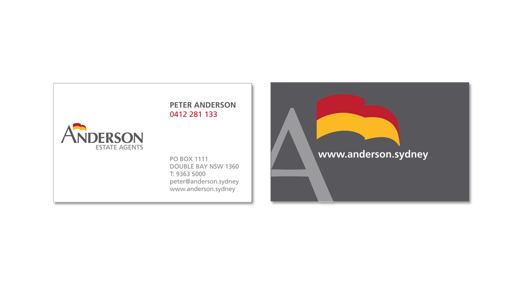
Peter Anderson original ran his own agency twenty odd years ago. Deciding to set up again, the challenge was to retain the brand recognition but re-invent with a fresh new look. The red and yellow flag was a key part of the old identity and the client was keen to retain it.
Solution:
Hopping Mad created a strong brand mark for Anderson, simplifying the flag to a more useable shape and integrating it with the typography. The client was thrilled with the result.
Like to speak to us about a similar project?
Complete the form below and we’ll be in touch to discuss it
"*" indicates required fields


